Thank you all for coming out today. It's fun to be on campus here — my wife and I walk around here a lot, but I'm usually looking at the buildings from the outside. It makes me miss being in school, if you can believe that.
Presentation
Reflections on what it means to design for good this late in the game.
April 14, 2019 · Presented at the Duke Ideate Conference

Thank you all for coming out today. It's fun to be on campus here — my wife and I walk around here a lot, but I'm usually looking at the buildings from the outside. It makes me miss being in school, if you can believe that.

I'm a User Experience designer at Viget in our Durham office, just down the road. We do events every now and then — we'll have you over sometime.
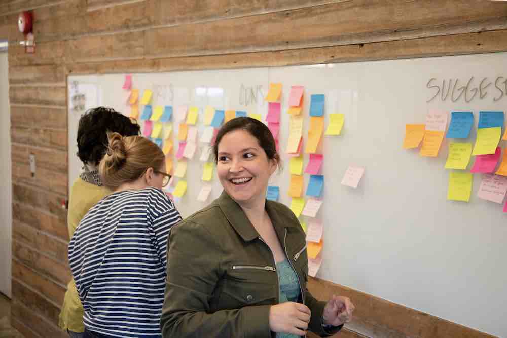
I couldn't find a picture of myself in front of a whiteboard with sticky notes, so here's my coworker Katherine, another UX designer. I think this makes us official?
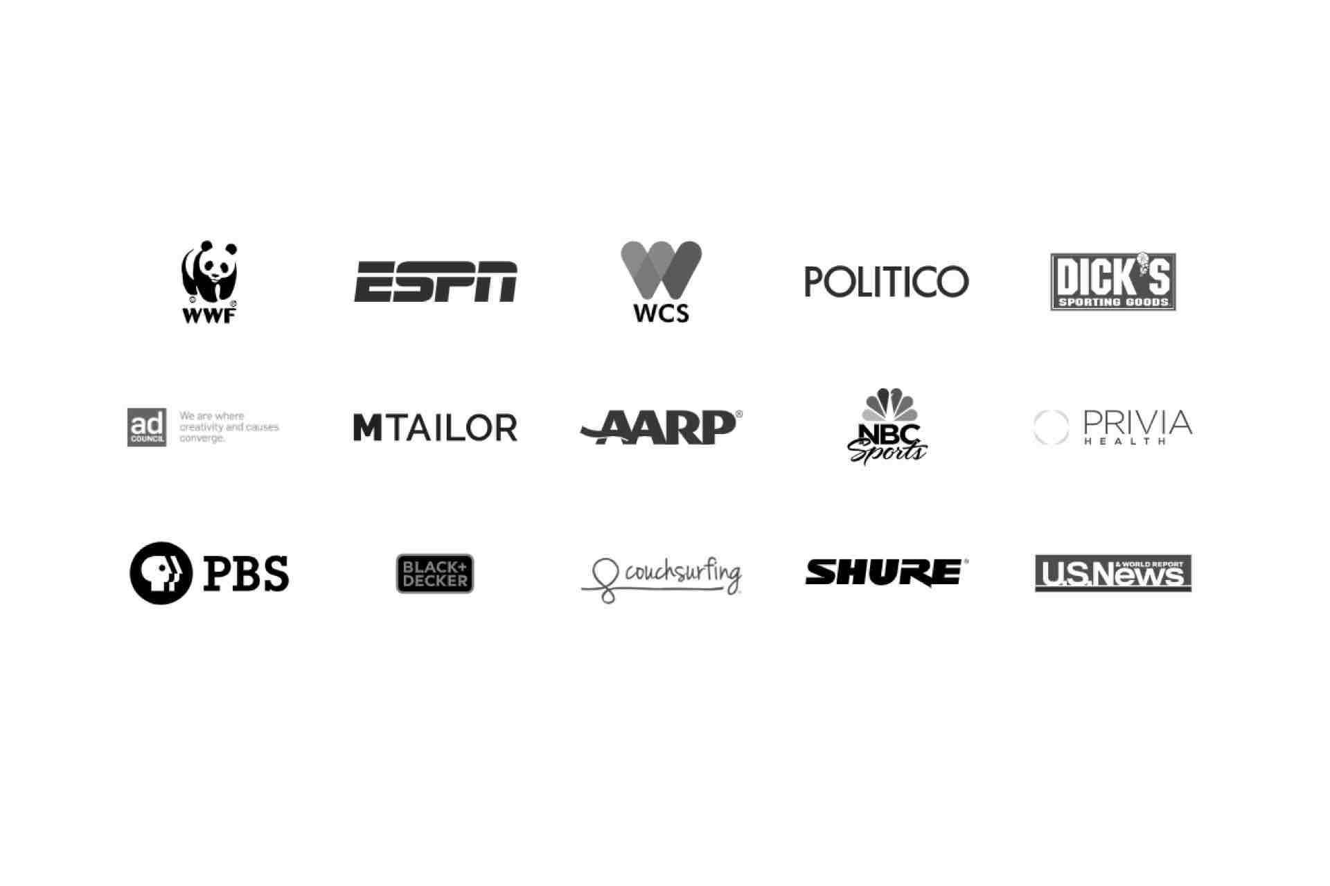
I won't talk too much about our work specifically today, but here's a look at some of our clients. We work with non-profits, start-ups, and all types of businesses. I'm happy to talk more afterward about Viget, design agencies, or the industry overall if anyone is interested.
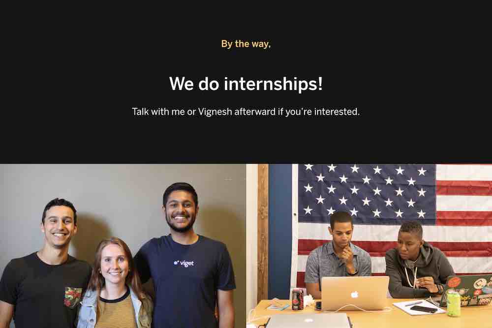
Also, we do internships and apprenticeships. One of the conference organizers, Vignesh, was our UX intern last summer. They're a good way to get started in the field. I'm happy to talk about those afterward, too.
Today we're going to be talking about design ethics, specifically the ethical dimensions of digital things. To do that, it'll help to take stock of where we're at today, as a society saturated in digital technology. There are no longer clear boundaries between our online and offline lives.
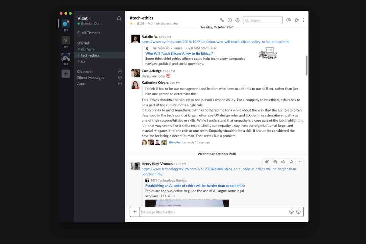
This blurring of the physical and digital gives us a lot to think about. We have a Slack channel devoted to discussing ethics in tech. It can be...distracting. But this is good stuff to be distracted by.
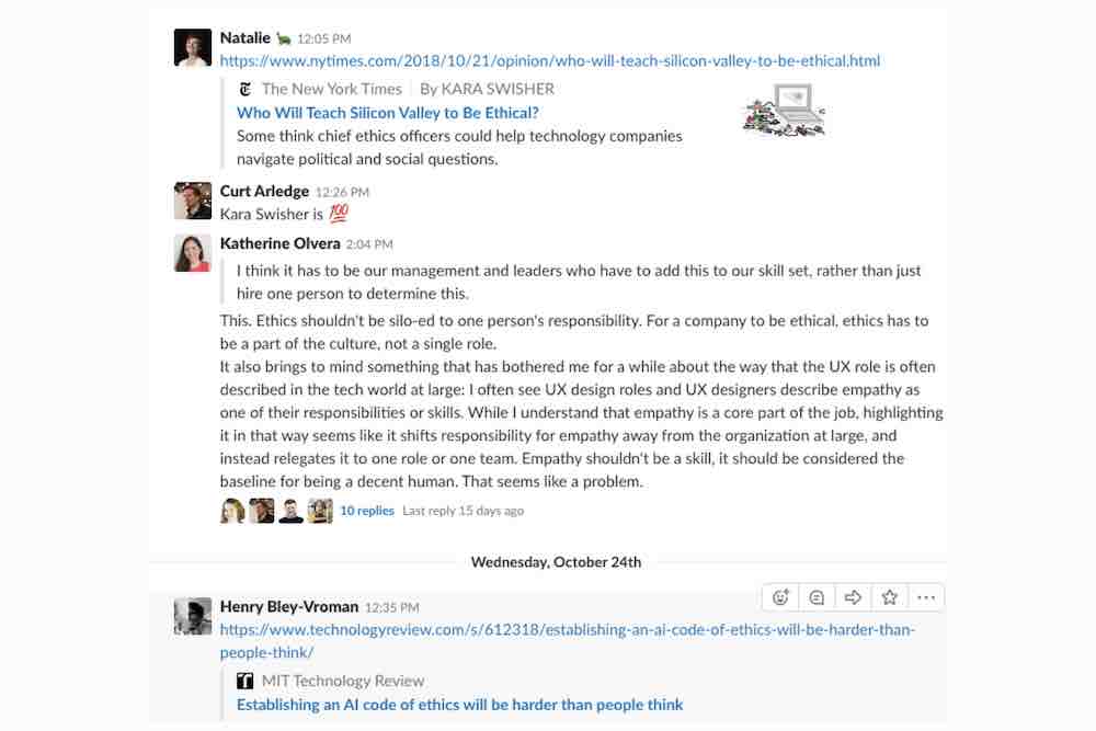
We talk about a lot of things, like how the Web amplifies hate speech.
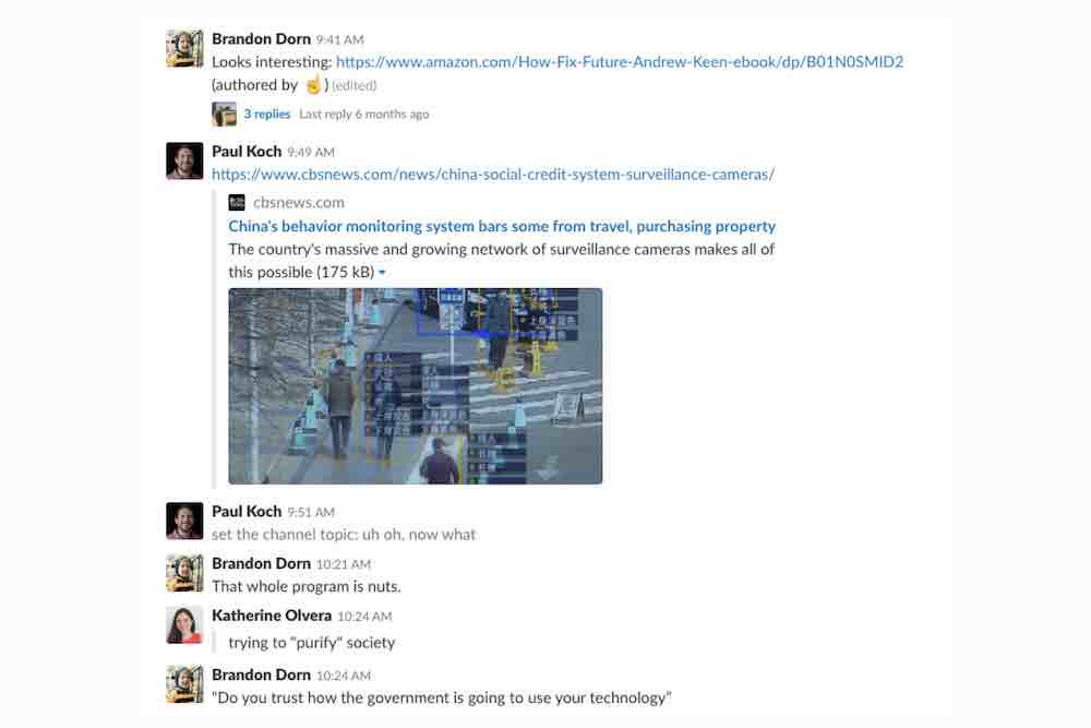
Or about China’s digital system of mass behavior control. People get “social credit scores” based on their behavior, buying history, friends, and web searches. China is not the only nation performing this type of surveillance, of course, but they seem to be using digital data in unprecedented ways.
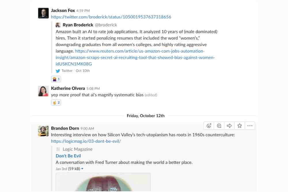
Or about how AI encodes and magnifies human prejudices. This is serious stuff.
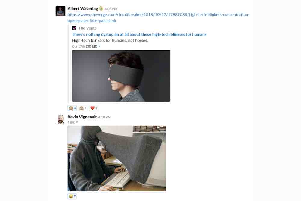
We also talk about these things too. Chic felt blinders to keep you from getting distracted. People are raising money for these on a crowdfunding site near you.
By the way, have any of you seen this Portlandia skit? Uncanny. Distraction-cancelling glasses! What a world.

We're trying to wrap our heads around these issues, to make sense of them and see how they play out in our work. At a recent company offsite, we made a list of a number of "ethical statements" that we pulled from design codes of ethics, and some we defined ourselves.
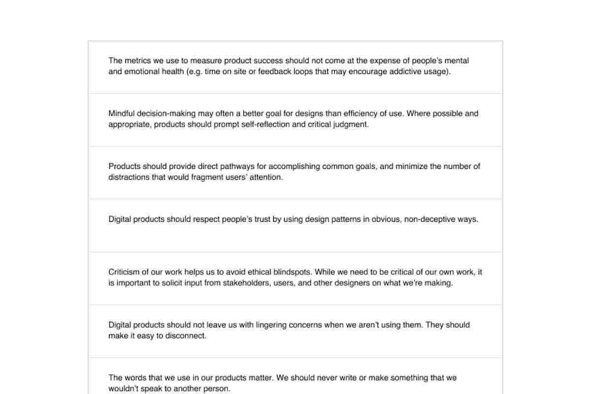
Some of these statements were things like, “Product default settings should favor users‘ best interests, and should be obvious and easy to change.” Or, “Mindful deciion-making may often be a better goal for designs than efficiency of use. Where possible and appropriate, products should prompt self-reflection and critical judgment.”
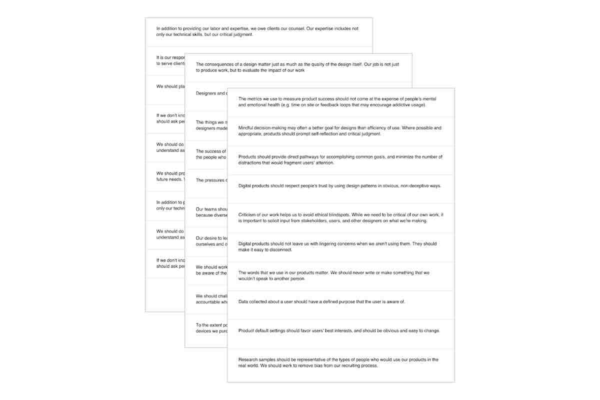
You can take a look at them here. We haven't yet defined our own code of design ethics, but are using these as the starting points for discussing what that might include. Statements like these provide language and criteria to hold ourselves to.
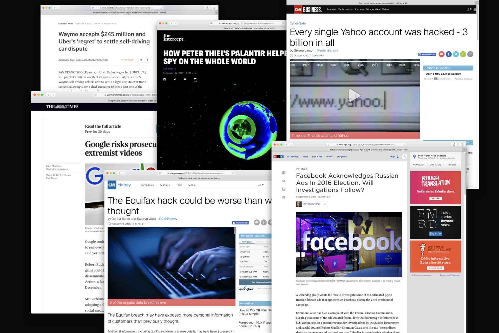
Because a lot of organizations aren't doing a good job of holding themselves accountable. Headlines reaffirm this pretty much every day now.
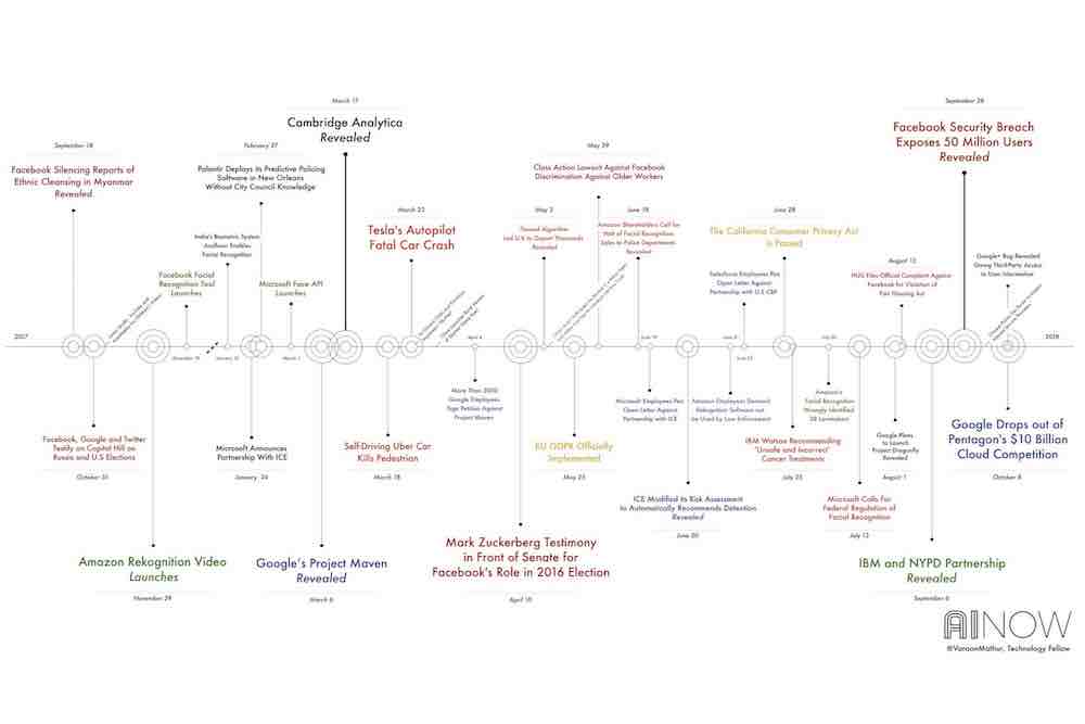
Here’s a timeline showing AI-related scandals just from 2017. Yikes!

Also, this happened. Politics aside, the 2016 election changed public perception of our connected information technology.
The election of Donald Trump showed us, as a nation and in a very public way, that the health of our information ecosystem matters, that people can be nudged and manipulated at scale, and that our digital life has a real impact on the world beyond our screens. The stakes of our technology are getting increasingly higher.
We’ve started to question the ultimate benevolence of our digital technology and the people behind it. This goes for the general public, but I think there is also a real identity crisis happening within the tech industry. Innovation and change aren't always for the better.
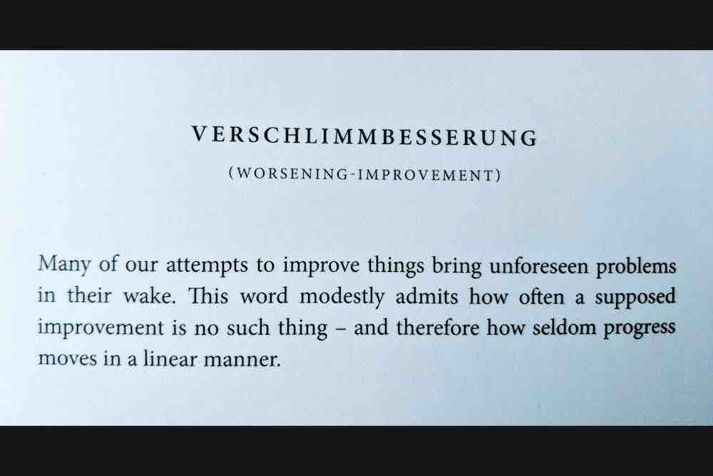
As it turns out, the Germans have a word for this: Verschlimmbesserung. "Making something worse by trying to make it better."
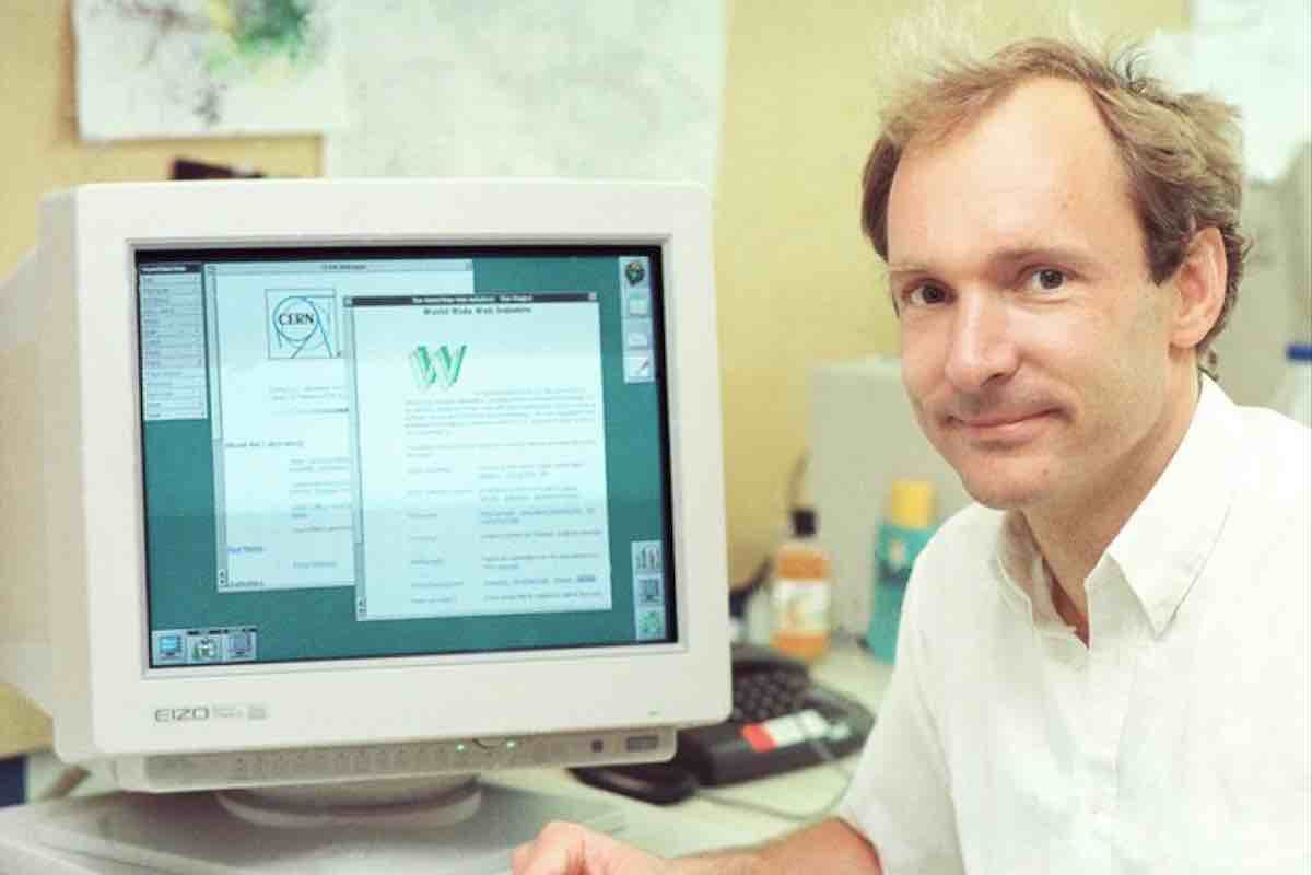
Some of you may recognize this guy — Tim Berners-Lee, the man who created Web technologies like the URL, hypertext, and HTTP. He anticipated many of these issues early on. In his 1999 memoir about inventing the Web, he wrote that “Information quality, bias, endorsement, privacy, and trust — fundamental values in society, much misunderstood on the Web [make it] highly susceptible to exploitation by those who can find a way.”
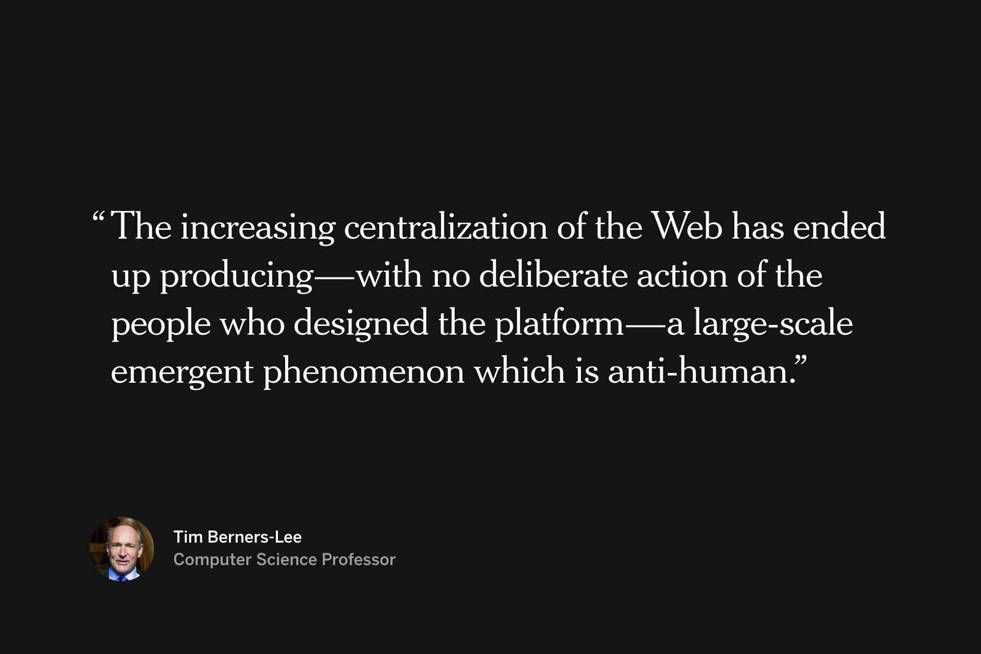
And in a recent interview, he gave an even more grim assessment: “The increasing centralization of the Web has ended up producing—with no deliberate action of the people who designed the platform—a large-scale emergent phenomenon which is anti-human.”
What I find remarkable about this statement is how it expresses the way in which our technology can get away from us. No one meant for us to get to the point we're at, where advertisers or politicians can use artificial intelligence to tailor messages in specific ways to people based on demographic information. Or at least we never seriously considered the harm that could be done with such technology. Facebook is experimenting with immersive AR and hasn’t even begun to solve issues with online harassment and disinformation.
All of this leaves me wondering what role I have in this as a designer, little old me, working at a tech company of 70 people. Because the more I learn about the dangers of technology, I’ve come to wonder whether I’m somehow complicit in what’s wrong, how I can avoid tacit acceptance of a destructive status quo, and what it means to make things better.
So I've been trying to find principles of good design, standards for my work so that what I make is good for the world.
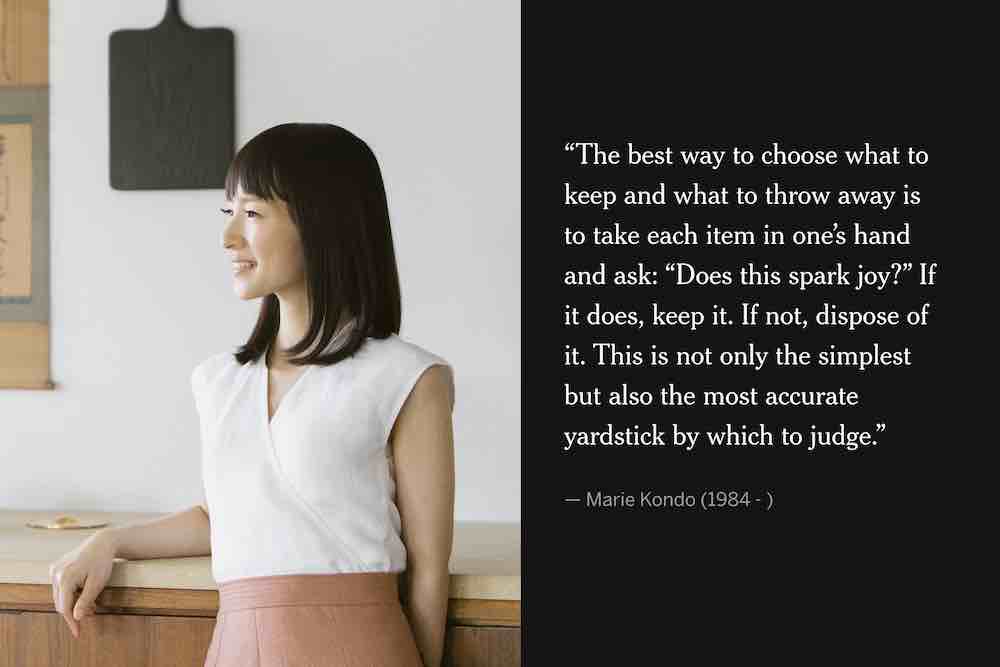
Asking questions like, "How do I prioritize things as a designer?" Some of you may recognize this woman, Marie Kondo. I haven't read her books, but I've learned her way of folding clothes. Changed my life. When determining what to keep in your house, she says you should pick it up and ask if it "sparks joy." Does it bring you delight? This may be a decent principle for figuring out which jeans to keep, but the idea of "designing for delight" has its limitations. I'll talk about that in a minute.
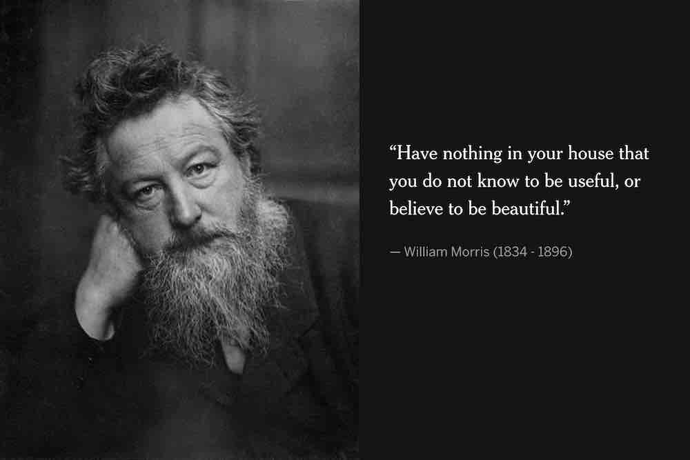
Here's a more nuanced principle from William Morris, a 19th century textiles designer, and leader in the English Arts & Crafts movement: "Have nothing in your house that you do not know to be useful or believe to be beautiful." My shovel may not "spark joy," but it's certainly useful. So we should think in terms of aesthetics and utility.
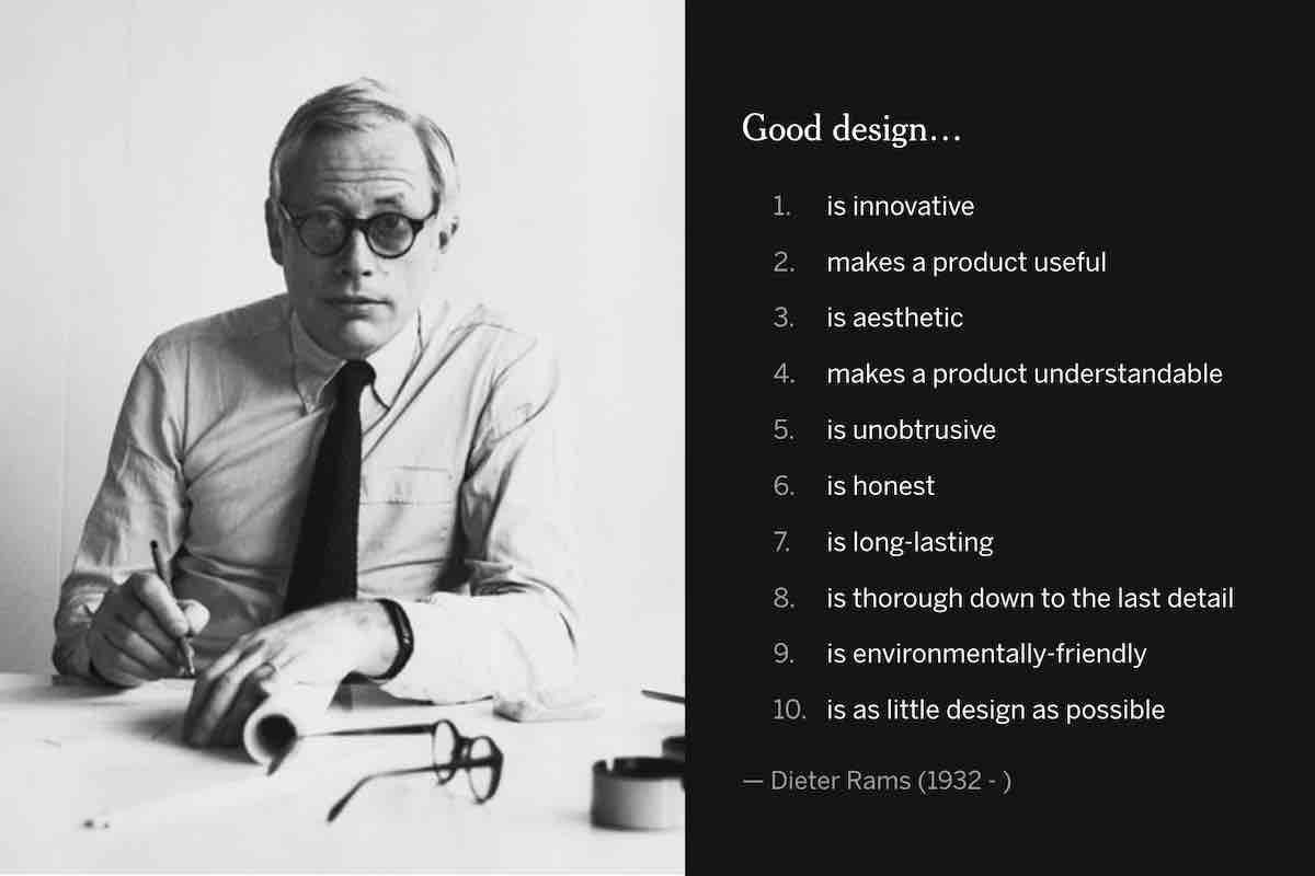
Let's go a step further. Dieter Rams was a German industrial designer in the 20th century, famous for highly functional and beautiful household products he designed for Braun. This is a summary of his Ten Principles for Good Design, a kind of ten commandments for all industrial designers.
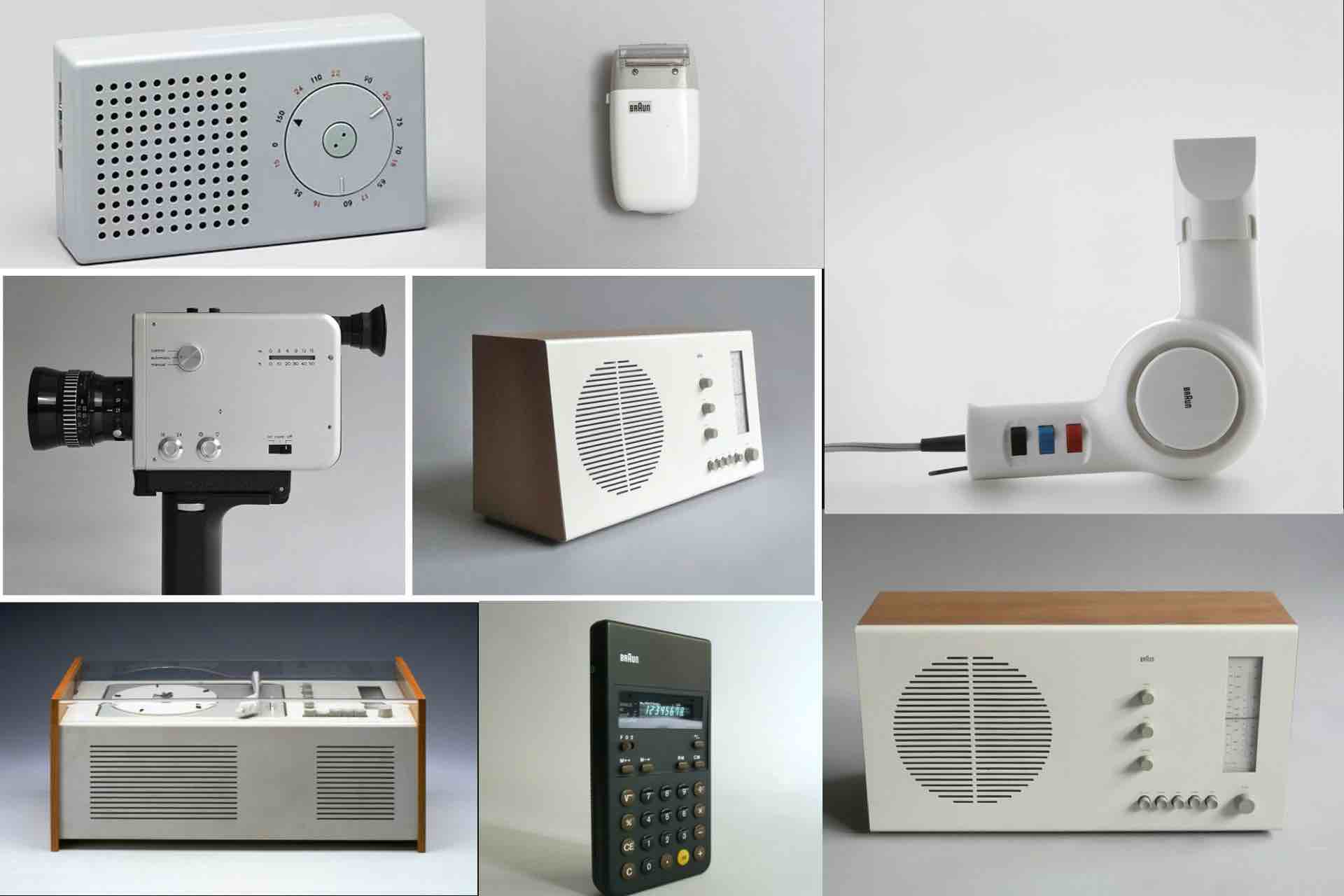
As a digital product designer, I've sought to learn from the best industrial designers, because much of what we interact with on a screen has conceptual roots in the physical world. Think of buttons, toggles, and the like. Here are some of the Rams' designs.
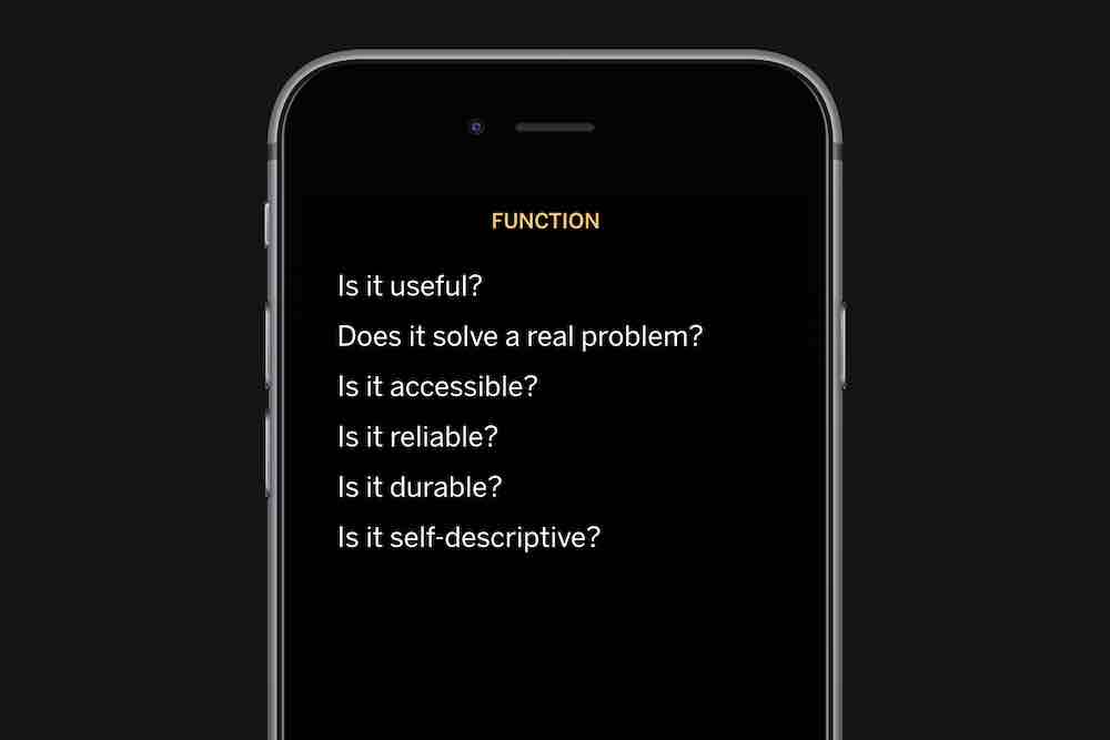
Generally speaking, we can think of Rams' principles in terms of function and form. Function: does the product or feature actually solve a problem? Is it reliable? Will it last a long time?
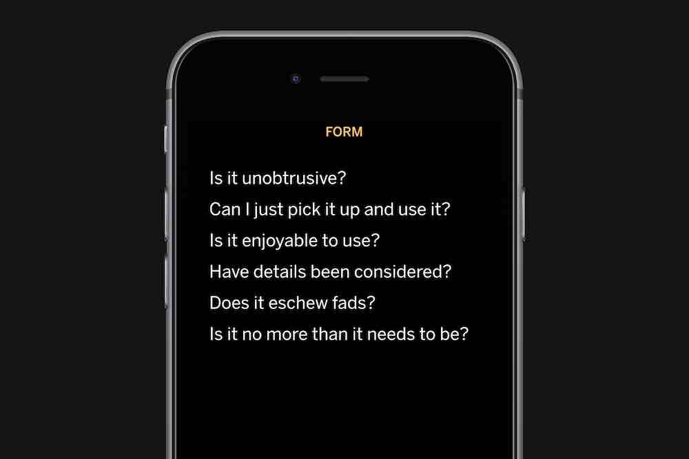
Form: is it easy enough to pick up and use? Are the features self-descriptive? Does it eschew fads? Is it no more than it needs to be?
These principles are foundational, and should be brought to bear on digital design. But digital technology complicates things, because it enables interactivity and communication in ways that physcial products don't.
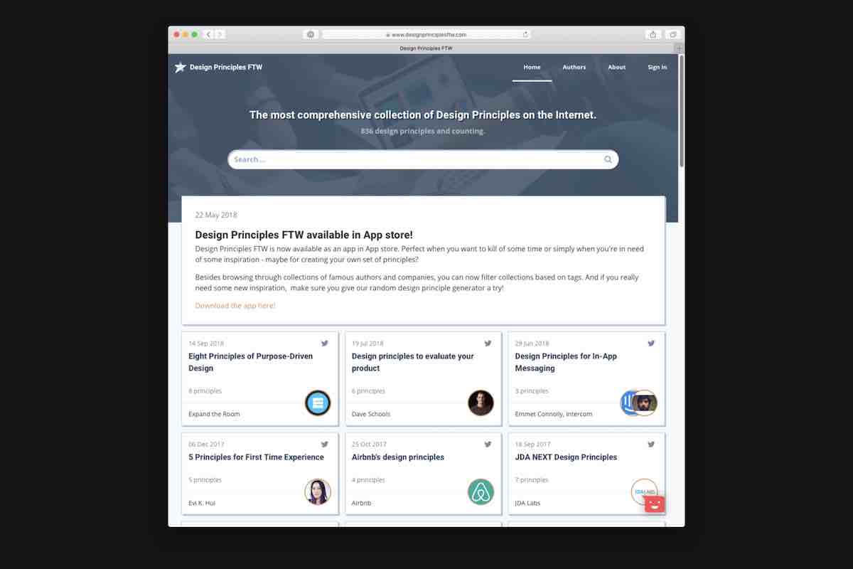
And as an industry, we're still coming to terms with this complexity. There's a website that catalogs literally hundreds of design principles written by individuals and organizations. Some of these are very good — I encourage you to check them out. But often the problem with design principles is that they are short sighted: looking only at the thing itself, and not thinking about its effect on the world.
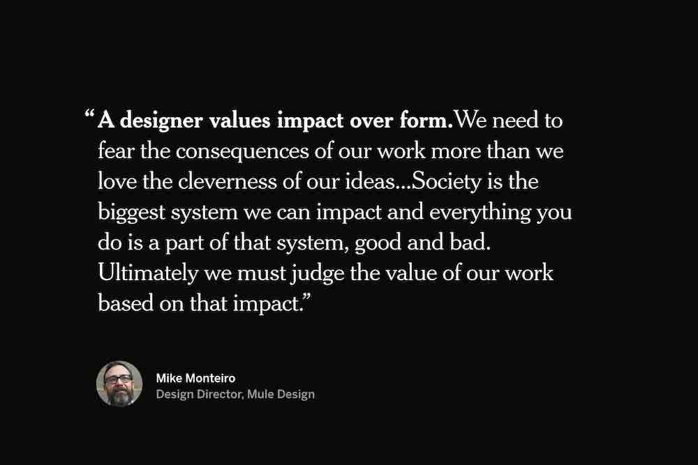
I like this thought, from Mike Monteiro's Designer's Code of Ethics: “A designer values impact over form.We need to fear the consequences of our work more than we love the cleverness of our ideas...Society is the biggest system we can impact and everything you do is a part of that system, good and bad. Ultimately we must judge the value of our work based on that impact.” These impacts aren't always obvious, but we need to be training ourselves to think this way.
Because what seems good in itself may end up being destructive. Something can be usable, seem beautiful, but have awful consequences, like the spread of disinformation on Facebook about Rohingya refugees. Or the vicious cycles caused by addictive games.
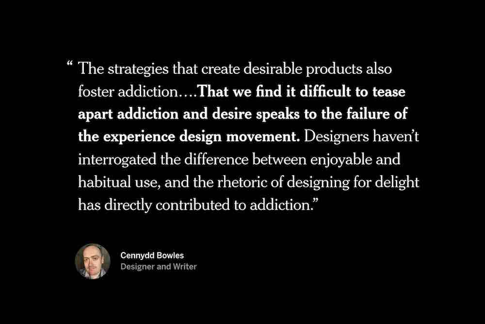
Cennydd Bowles expresses this really well. “The strategies that create desirable products also foster addiction….That we find it difficult to tease apart addiction and desire speaks to the failure of the experience design movement. Designers haven’t interrogated the difference between enjoyable and habitual use, and the rhetoric of designing for delight has directly contributed to addiction.”
This isn't to say that designing for delight is inherently bad, but that it‘s a questionable end in itself.
If there's one thing to walk away with today, it's this: that usability isn't enough, beautiful isn't enough. We have to ask if what we're making is good.
Let's talk about how we can think about what makes something ”good.“
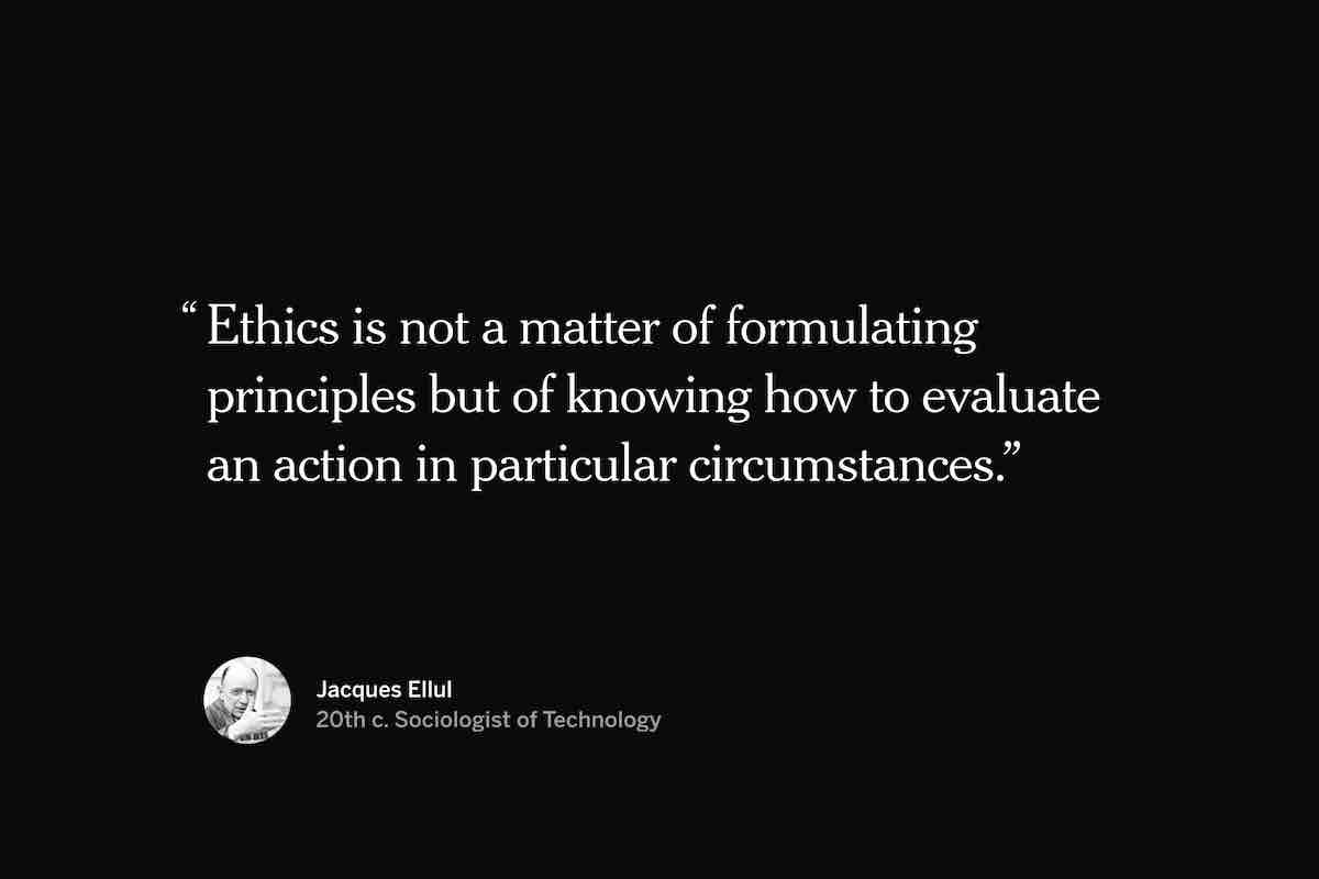
Ethics doesn’t give answers, but prompts questions to help you find answers. It isn’t just about being nice; it’s about interrogating our work. Holding it up against the things we value. Jacques Ellul, a 20th century sociologist of technology, puts it like this: “Ethics is not a matter of formulating principles but of knowing how to evaluate an action in particular circumstances.” Evaluating an action in context.
To summarize it further, you could argue that ethical thinking comes down to this question: “What should I do?”
So as designers, trying to design ethically, we need to ask: “What should I make?”
That question brings us back to the question of what makes something good — the ethics of designed objects. There are many ways to approach this question. I won't go into too much detail here, but generally speaking, people either locate ethics in the designer, transcribing their values into an object, or in the broader culture, which informs how an object is used. You can also look at the goals of the people using it, and how usage evolves the design over time.
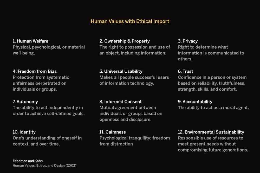
For the purposes of today‘s conversation, I‘ll focus on the ways in which digital technologies either support or hinder human values. Here’s a list that gives us a good place to start — what authors Friedman and Kahn call the “human values with ethical import.”
We take many of these values for granted as conscientious designers. But they can serve as a rubric for evaluating designs. Remember, ethics is the act of evaluating actions in context.
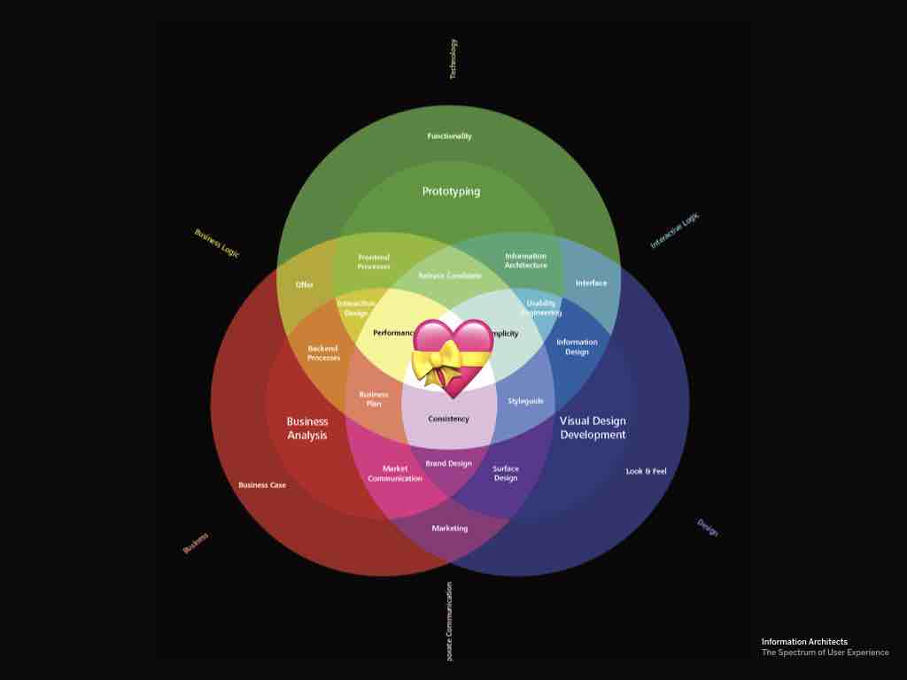
And if you think about it, this is the heart of UX: we think about design decisions in the context of lived human experience. UX has ethical concerns at its core.
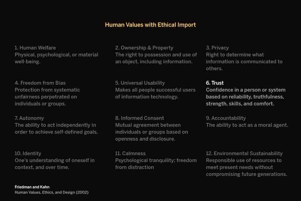
Take trust, for example. We trust someone when they reliably treat us fairly and respectfully. In an interface, this means that buttons do what we expect them to when we click them, or content is clear and up-to-date. Many dark patterns take advantage of people’s trust by using a common interaction pattern in an unpredictable way.

Like the Windows 10 Modal a few years back. Normally, when you click a “close” link in a modal, the modal closes and you cancel the action. Microsoft was getting impatient with people who weren’t upgrading, though, so they ended up changing the behavior of the close link. Instead of hiding the modal, clicking “close” agreed to the update. The technical term for this is a bait and switch.
I like what one commenter said about this: “It’s like going out to your car in the morning and discovering that the gas pedal now applies the brakes, while the brake pedal washes the windshield. Have a fun commute!”
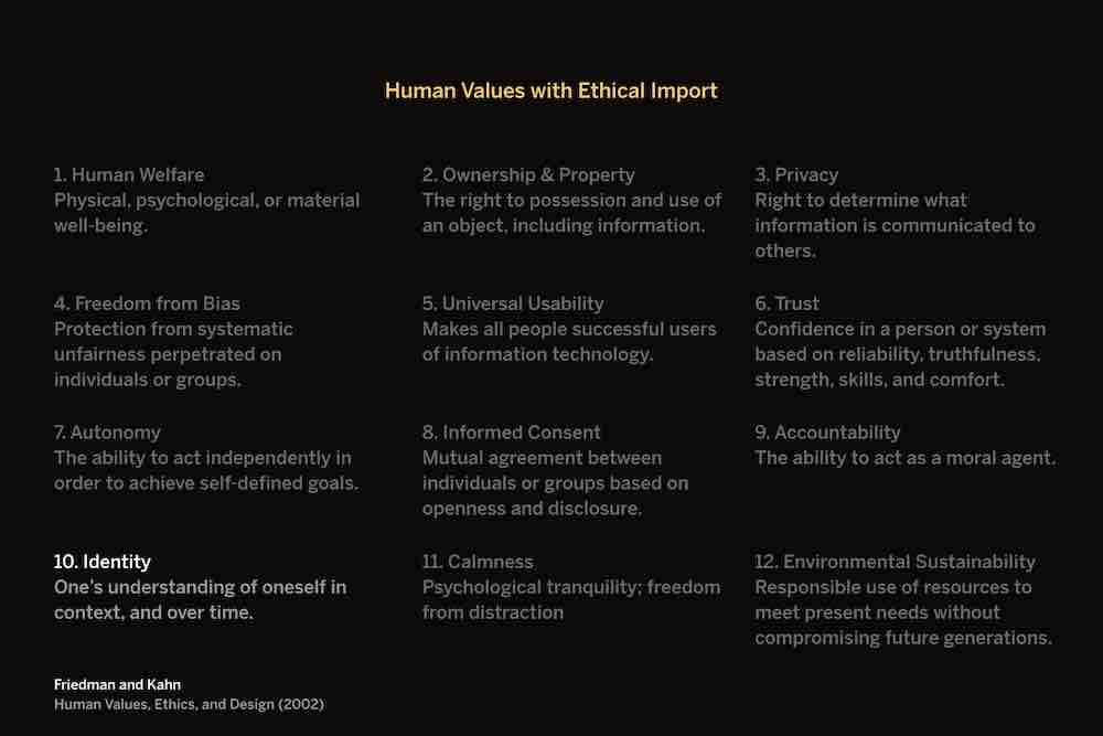
The value of identity is a little less obvious. It has to do with the way that people are represented in digital systems. Psychologists remind us that our personalities are unified and multiple. I am one person, but I am a slightly different person at work than I am at home, or when hanging out with my brother, or when walking my dog through the woods.
What we need to always keep in mind is that digital representations of people are inherently reductive. People cannot be fully represented by a system, digital or otherwise, because they are being represented on the system’s terms. We inherently know this. Our Facebook or Instagram or Medium profiles only show a little of who we are.

Charles Gaines dealt with this in idea in his paintings in the 70s. I actually saw some of Gaines‘ work at the Nasher last summer, which is where I first learned about him. In some of his pieces, he would take a photograph, then begin abstracting it to show how systems distort people and things even as they try to represent them. They “objectified people beyond recognition,” to use the words of one commentator.

Sometimes the digital things we make our beautiful. But we can’t forget that we are making systems that represent real people and things. It’s up to us create systems avoid reductiveness to the extent that they can. To allow ambiguity and fullness of expression and representation. This is obviously a complex thing to accomplish.
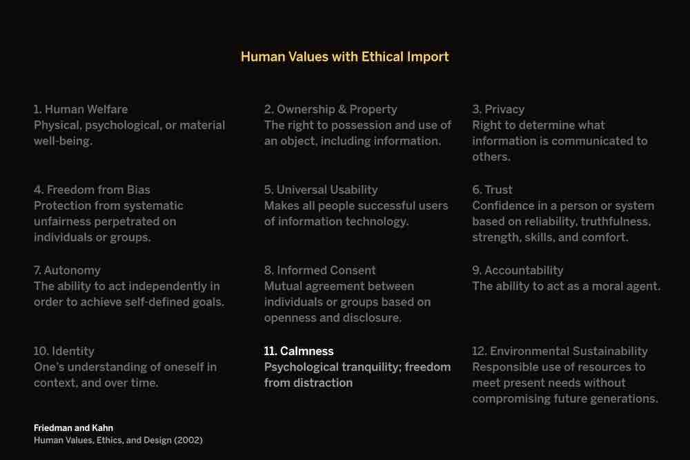
Let’s look at one more value: calmness. At this point in the game, we’re all growing tired of our devices shouting at us. We’re getting better about this as a society: you don’t hear ringtones very much anymore in public (though they can still be handy). And alert settings have improved, with things like Do Not Disturb mode.

Alerts are an annoyance on our devices, but as we move into an era of ubiquitous computing, where computers are embedded into environments, alerts and notifications can become serious issues. We need to learn to make technology that remains passive and peripheral, announcing itself only when absolutely necessary.

A few years ago, appliance companies realized that refrigerators didn’t have screens on them yet, so they fixed that. Now you can buy a fridge with a monster iPad embedded into it. We heard you liked iPads.
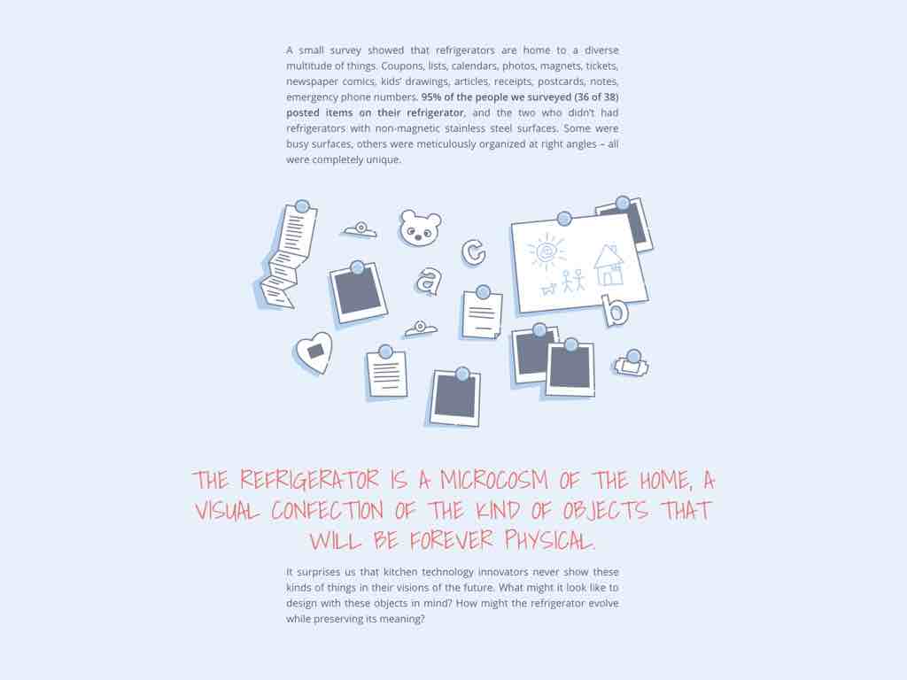
So myself and a few designers at Viget worked on a design concept that thought about what it would be like for appliances to have screens but remain unobtrusive. Instead of letting you check your email while filling up a glass of water, how could a refrigerator interface preserve the ways people currently use their refrigerators? What if we didn’t try to co-opt the space by slapping an iPad on it?

We asked people to share pictures of their fridges, and saw exactly what you’d expect: pictures, clippings, kids’ drawings, weird magnets. Refrigerator surfaces are perfect for what they’re used for. They were folksy and cute and idiosyncratic in ways the standardized screens can never be.
So we thought about how a display could still allow people to post physical objects, but draw next to them on a digital e-ink display. E-ink is a lovely technology: it’s easy on the eyes in the way LED screens aren’t, and remarkably energy efficient. We tried to design an interface that remained peripheral to the life of the family.
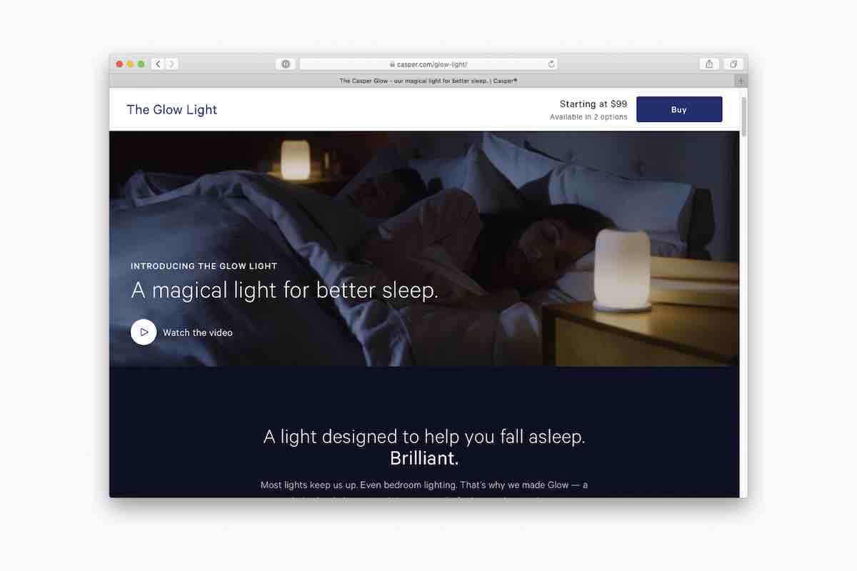
Maybe some of you have seen these new connected lights designed by Casper, the company that sends you a bed in a box. These are a neat example of calm technology: the light starts to dim as your bed time approaches and wakes you in the morning by turning back on.
My favorite thing about these, aside from their form factor, is that they prevent you from habitually keeping your phone next to you when you sleep. You can do that with a $20 alarm clock too, of course.
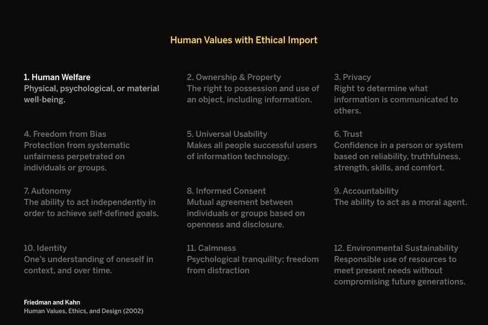
Human welfare is a pretty encompassing value — it has to do with psychical and psychological well-being. We need to consider both when designing digital things.

To give an example of a company not caring about human welfare as much as they should, or could. This is Reed Hastings, the CEO of Netflix. He recently said something interesting about who he sees as Netflix’ main competitor. Do you know what he said? Not Hulu or HBO.

It’s sleep. And this makes sense, in a kind of upside-down capitalistic sense. They’re the global leader in content streaming. And people fall asleep when watching auto-played shows at night. But what if they chose to respect sleep as a human limit?
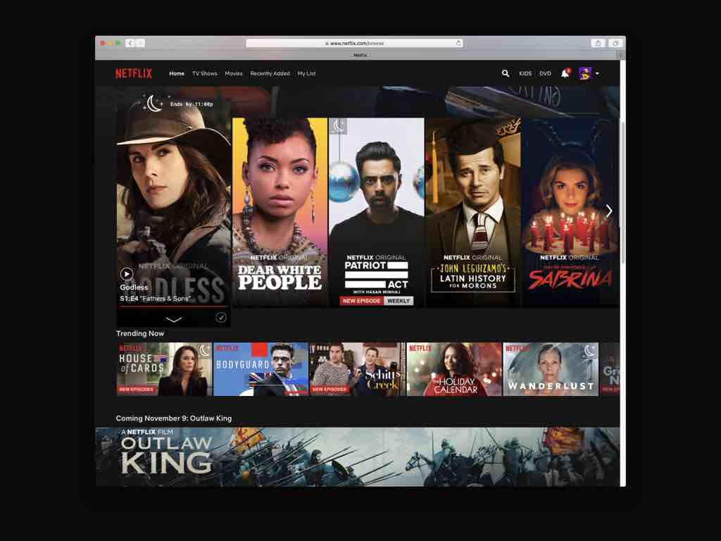
What if you could set your bedtime in Netflix to see what movies or shows you could watch and still get to sleep on time? My coworker Dave came up with this idea.
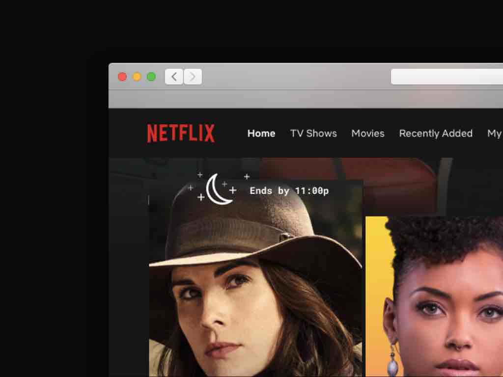
Maybe you'd see little icons for movies that match the bedtime you set for yourself, and a nice detail on hover.
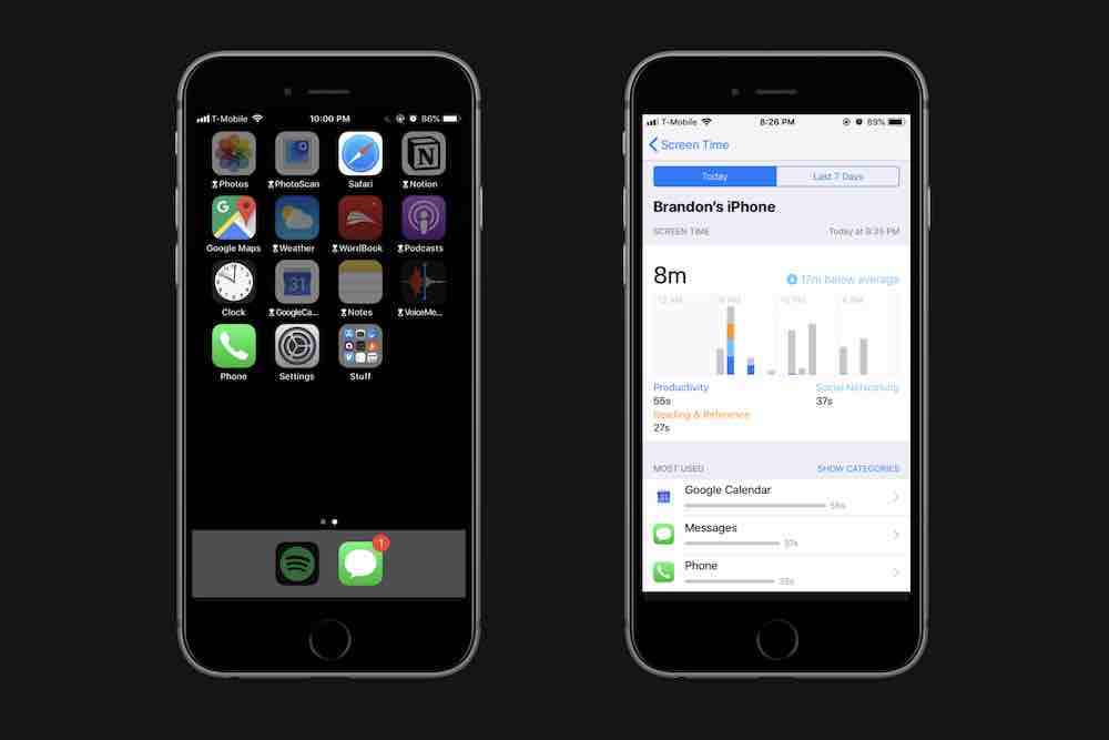
Apple introduced a default utility in iOS 12 that prevents access to apps around certain times of day. You can still access them, but it'll ask if you want to ignore your screen time limits first. It'll also show you your weekly app usage. Sometimes this is depressing to me. But it can be encouraging too. We're realizing we want to be on our screens less, and these kinds of features help us in that way.
It's worth noting that Apple is interested in these features in a way that Google, Facebook, and Twitter typically aren't, because Apple's business model is different: they make most of their money on selling products and services rather than ads. But even for companies with ad-based business models, features like these send a signal that they see you as a person, not just a means to profit.
I like this idea, from the folks at the Center for Humane Tech. They show how Google maps could suggest transportation options based on fitness goals that you set. A lot of what I'm sharing today I've learned from them. Tristan Harris, one of the founders, came up with the ideas behind Apple's Screen Time utilities.
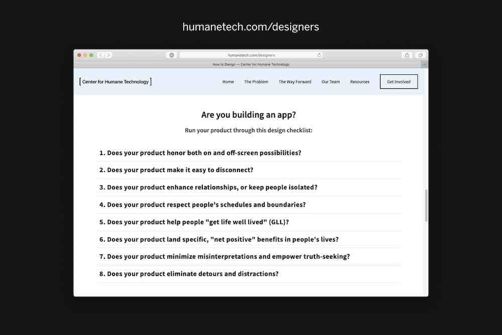
I recommend checking out their website — there are a lot of good resources there for designing ethically, like their principles for designers. They give us good questions to ask of our work: “Does your product make it easy to disconnect?” “Does your product respect people's schedules and boundaries?” There often aren't clear-cut answers to these, but these are the kinds of questions we need to start asking until they become standard practice.
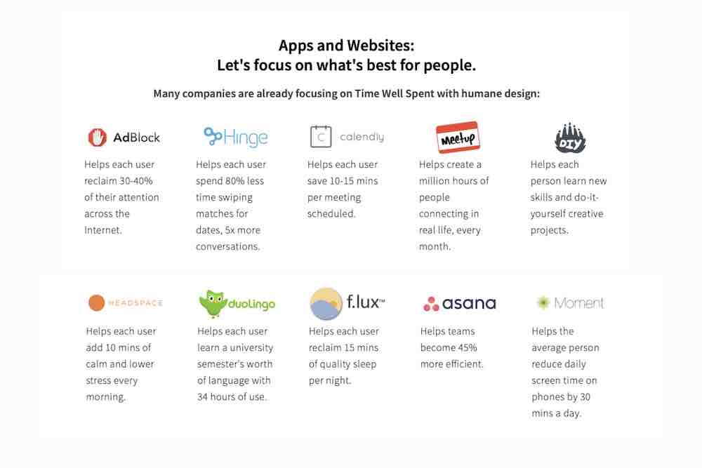
They list some companies that they see as following these guidelines well — companies like Meetup, DIY, and apps like Headspace. They also have Duolingo up there, which I know is a little...

...questionable. But it's a great app, and certainly helps people toward a good end. We need to be looking for examples of companies doing things well; it's easy to get fixated on those that are screwing up.
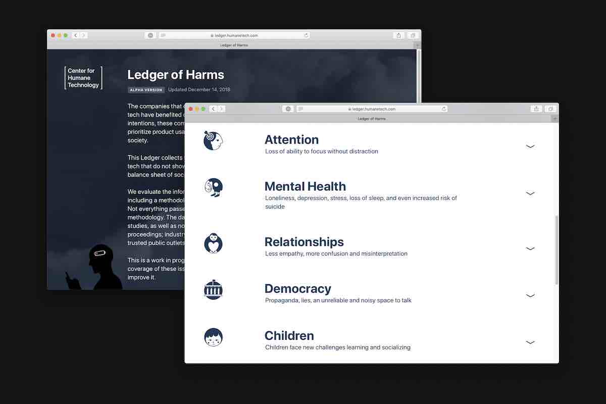
They also have what they call their “Ledger of Harms,” a list of the ways that technology damages our lives and society. They're working to put specific language to what are often diffuse, overwhelming issues, providing research and evidence for each.
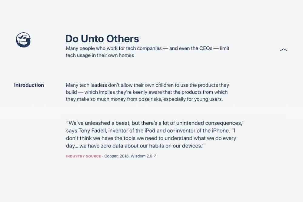
I found this one particularly well-put, about the hypocrisy of many leaders in tech: “Do Unto Others.” They know the consequences of what they're putting into the world, but are shielding their own families from them, sending their children to Waldorf schools, where screens aren't used at all.
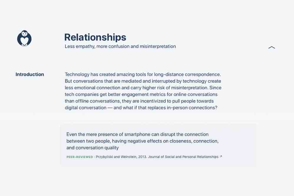
This was a good one, too — it addresses the way relationships are impacted by the presence and mediation of digital technology. Our sense of what's normal is changing, which is itself normal, but also makes me wonder what we're surrendering to, and for.
It's important to keep perspective on this. Technology isn't all bad. But it tends to play to our worst instincts. And, as an industry and society, we haven't yet figured out how to make and use it in a way to preserve our well-being. To protect human values. The problem is two-sided: we need to learn how to design it for well-being and use it for our own well-being.
I’d like to close with some thoughts about the kind of design that inspires me, and that I hope to get you excited about.
Ethics may seem like a downer topic to talk about at a conference about ideas. Ethics is about respecting limits, saying “no.” But saying no to destructive ideas frees us to say yes to better ones. This is the case no matter where your work and ideas end up taking you.

Because here's the thing: values-based technology is the future. It's the future in the same way that renewable energy and sustainable food production is the future. These practices run counter to the shortsighted profit motive that defines our economy. They take a longer look at human welfare. It took society a long time to catch up to these ideas. Public opinion is just beginning to shift, thanks in large part to seeing Silicon Valley executives testifying before Congress. And though sustainable energy and food production practices are catching on, they aren't yet pervasive — at least not in the US. The ethical design movement can learn a lot from the organic and clean energy movements.
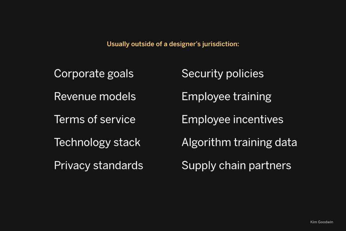
It will be an uphill battle for designers, because many of the decisions that affect what our technologies do aren't made by designers. Here's a list of some of those decisions, put together by a woman named Kim Goodwin. As a discipline we're reckoning with the limits of our professional role.
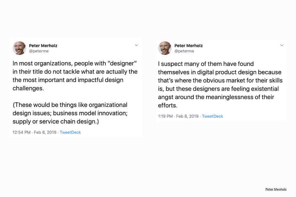
Peter Merholz puts this well: “In most organizations, people with ‘designer‘ in their title do not tackle what are actually the the most important and impactful design challenges.” We‘re often not the people making these decisions, but we need to have an informed perspective on them, to challenge those in power, and to prepare ourselves for when we are in those positions of power.
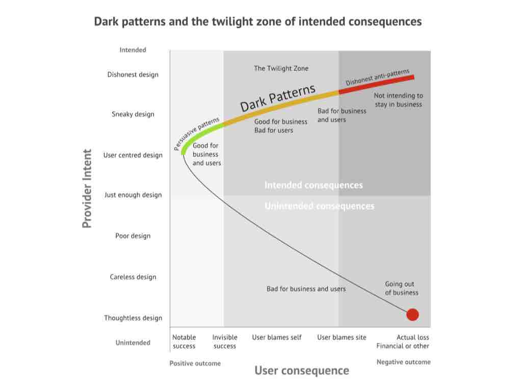
And we need to be honest about how hard it is to just do work that's good on its face. To design usable, beautiful websites. To help clients with thorny information architecture issues. To make extensible, consistent design systems. Most of the time I’m just trying to help clients get to usable. I’m trying to get them up here (left quadrant), into healthy persuasive patterns. Usually they’re somewhere down here in this danger territory. But they aren’t up here, dangerous enough to manipulate people, or insidiously trying to co-opt their attention. But someday they might be, and I want to help them think critically about what they’re after.
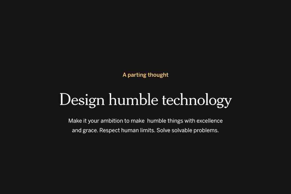
So here’s my final thought for you. I want to encourage you to design humble technology. To make it your ambition to make humble things with excellence and grace. Respect human limits. Solve problems that design can solve.
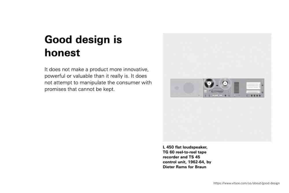
Dieter Rams’ sixth principle is that good design is honest. “It does not make a product more innovative, powerful, or valuable than it really is. It does not attempt to manipulate the consumer with promises that cannot be kept.”
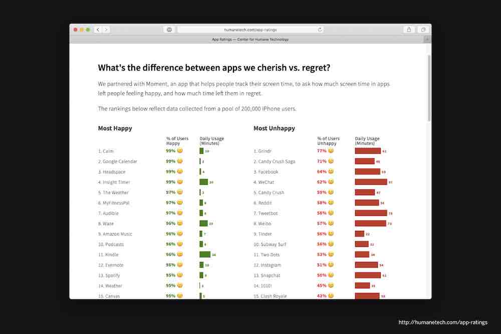
Humble design does not attempt to manipulate the consumer with promises that cannot be kept. There are a lot of unkept promises in digital technology today. A study was done on the apps that people felt most happy and most unhappy using. Lots of unkept promises of happiness on the right.
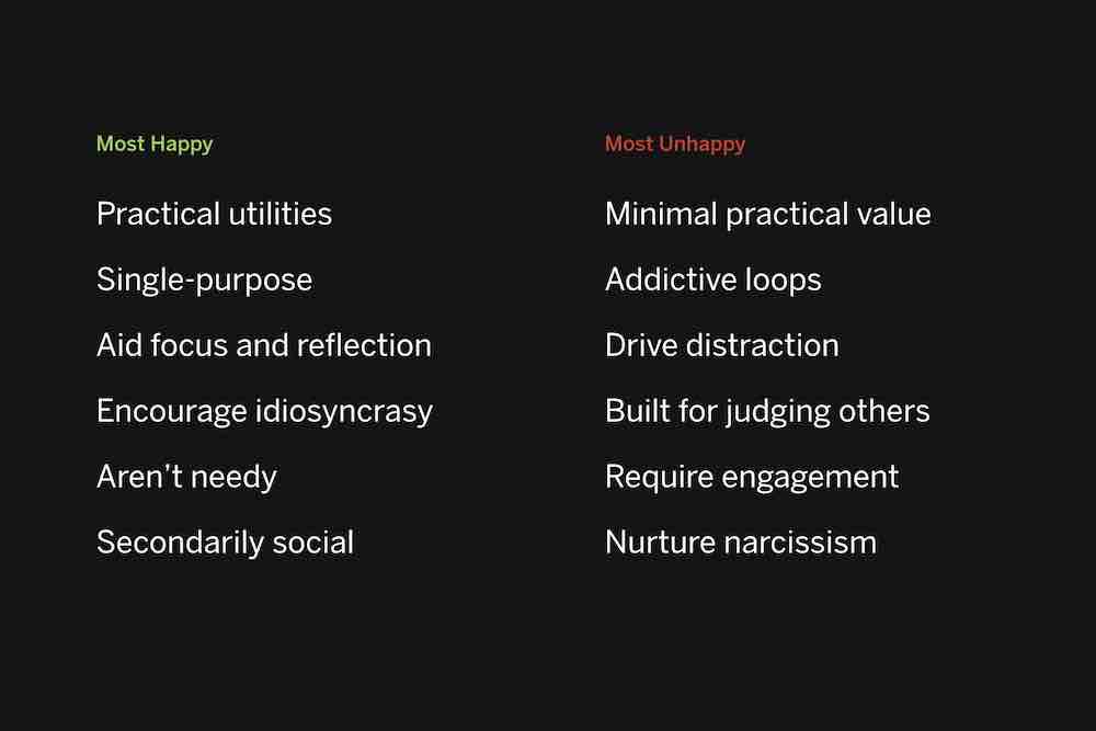
What makes the things on these lists different? Here are some things that stood out to me. The apps on the left are generally straightforward utilities, practical, single-use, idiosyncratic, aid focus and reflection, don‘t demand attention, may be social, but only secondarily. Many have a single purpose. Those on the right have minimal practical value, seek to create addictive loops, distract us from our daily life, are inherently built for judging others, nurture narcissism.
This may seem extreme. Instagram isn‘t ruining our lives. But when we try to understand why certain apps leave us feeling drained, despondent, and distracted, I tend to think these are some of the reasons. And those that help us feel productive, focused, and encouraged? The characteristics on the left seem right to me.

Here are some of my favorites. They don't get everything right, but I appreciate that they focus their innovation and design on helping people perform do things well, whether that's organizing thoughts, getting from point A to point B, scanning photos, exercising.
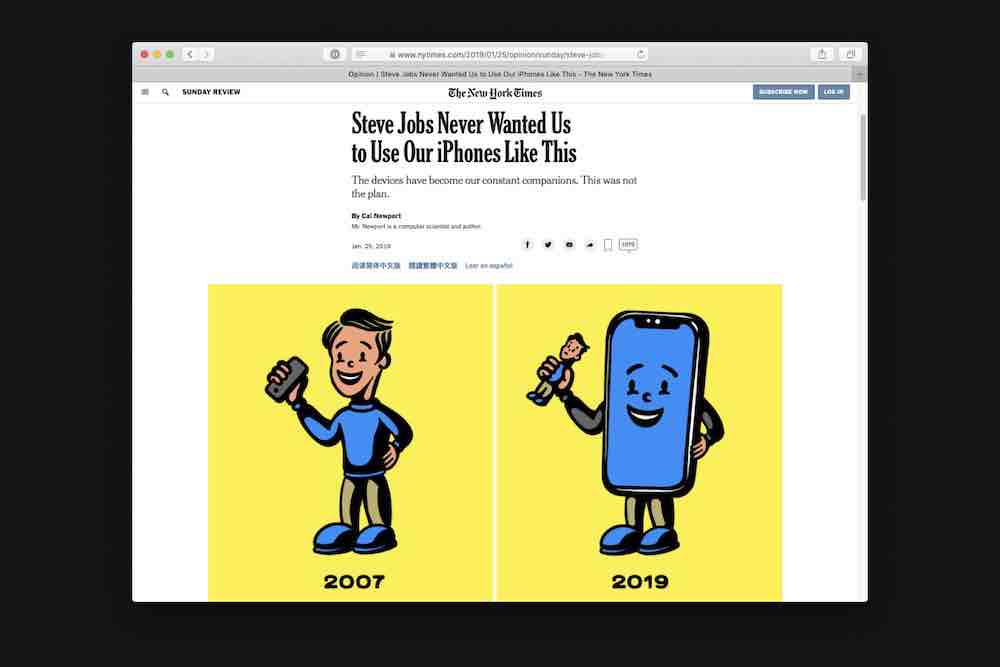
There was a piece in the Times recently that looked at some of Steve Jobs reveal of the original iPhone. The author points out that Jobs intended the device to be a means to other ends — a utility, not a way of life. Pretty stellar illustration, too.
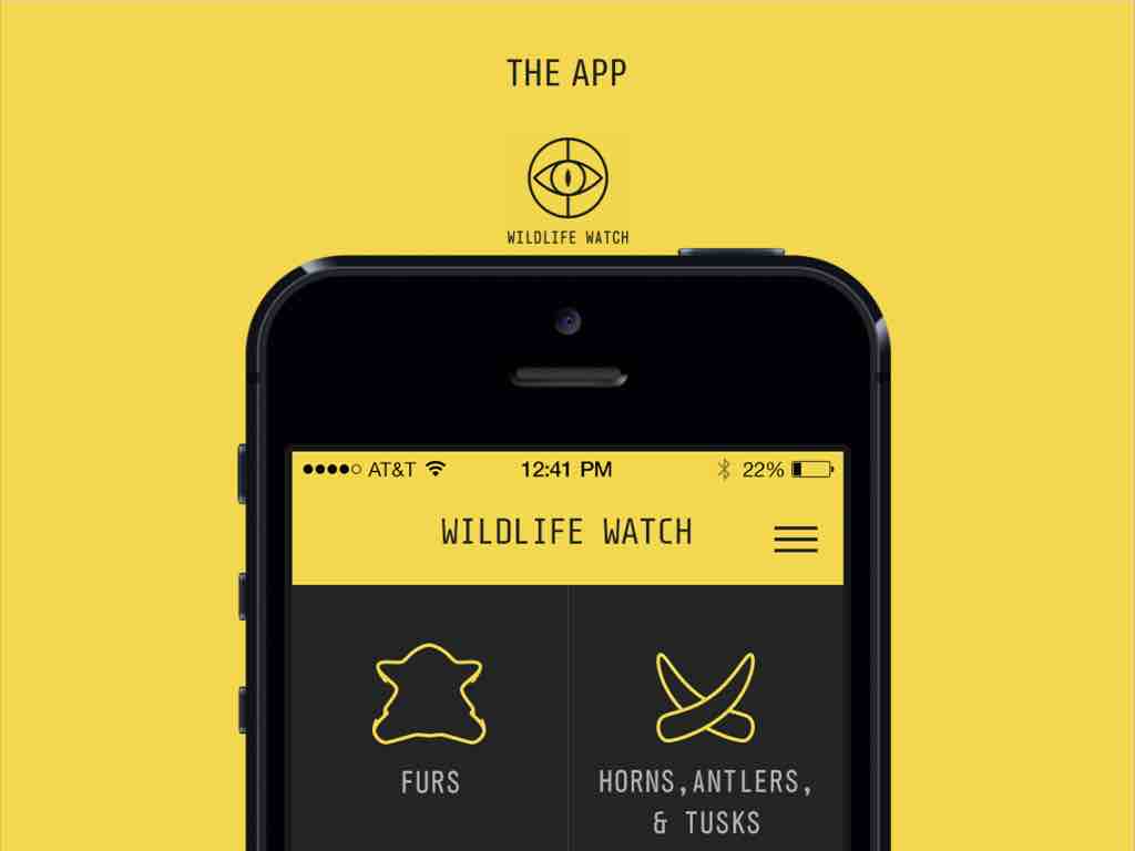
One of my favorite things that Viget has made is this app for the Wildlife Watch for the Wildlife Conservation Society. It helps customs agents quickly identify animal pelts at customs borders. Not all animals are illegal to hunt, but it can be difficult to distinguish between them.

The UI asks simple questions about the item to help people understand what they’re looking at. The technology is benign, clearly using design for good.
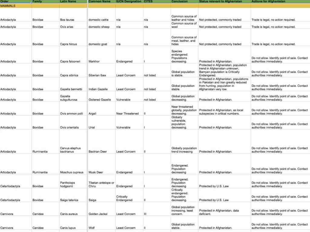
One of our UXers made a database of all the logic needed to figure out what you’re looking at. This kind of stuff is the best. Doing what we can do to help people make clear-sighted decisions that better the world. That's what I aspire to.

Thanks for listening.