
This is the schedule that staff hand out after shows at Cat’s Cradle, a long-time venue in Carrboro, NC, just west of Chapel Hill. The schedule is small, relevant, and indy, like the venue itself.
After picking up a couple of these, I began noticing how thoughtfully they were designed despite being throwaway strips of paper.
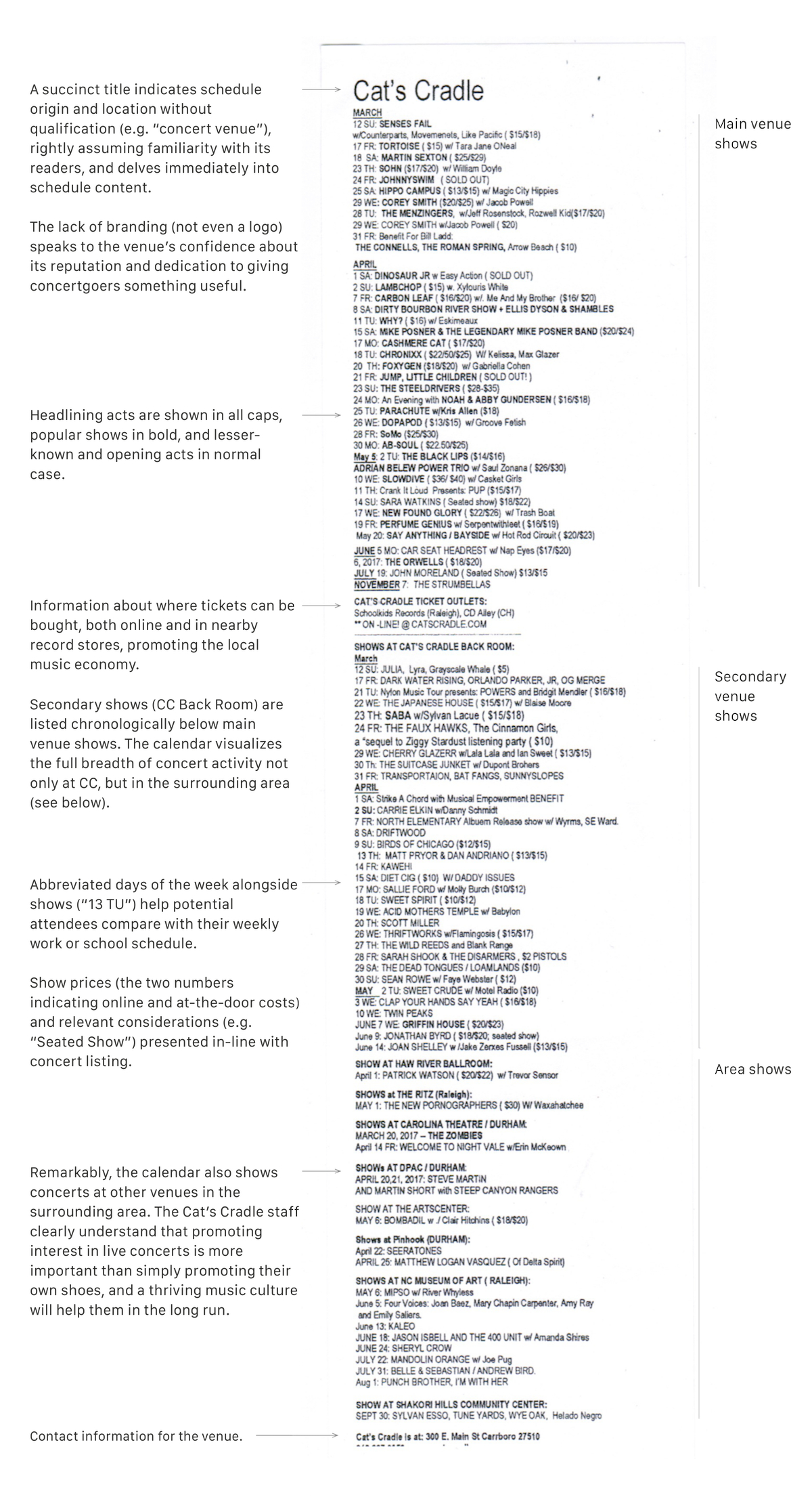
Marketing is rarely informative or considerate of readers. And marketing that aspires to be useful usually just ends up as gimmicky corporate knicknacks (refrigerator magnets, letter openers, paperweights). Yet this unassuming schedule markets and informs in equal measure, which is to say it markets Cat’s Cradle in a way that respects the intelligence of its audience.
The flyer is timely (it will be a useful reference for 3+ months), makes credible assumptions about its readers (people receiving the flyer don’t need Cat’s Cradle explained to them), cuts to the chase (no preamble, just schedule), is easy to produce (any word processing software could be used, making it easy to update, print, and cut the day of a show), is economical (3 flyers can be printed on a 8.5” × 11” page), and, significantly, is generous, promoting shows at other venues in the area to support the local music culture.
The content is the design. This kind of thoughtful typography and information architecture bears the mark of refinement over time by people who care about what they do and who they do it for.
The type is admittedly small, but the density of information that they’ve fit into 27.5 square inches is admirable. And it isn’t as though we aren’t used to holding up small type to our faces for better resolution. I overheard a guy complain to his son that he could barely read it, after which he picked up his phone and start reading type that couldn’t have been much bigger. If a casual glance at the schedule gives the impression that it is small and cluttered, that’s only because we don’t expect the same of everyday things like calendars that we do of rich information designs like newspaper stock or sports pages.
The FT has a good piece on this: “When dense makes sense: explaining complex data in charts.” “You don’t have to simplify things if the audience doesn’t need it.”