Product design
Dwell
I redesigned user-created projects on Dwell.com to make the site a go-to design resource in the social media age
- Role
- Product design lead
- Responsibilities
- Product strategy, prototyping, design system, user research
Product design
I redesigned user-created projects on Dwell.com to make the site a go-to design resource in the social media age

When we launched Dwell’s digital subscription service in 2020 we quickly saw an increase in revenue, making Dwell.com an even more important platform for the company’s long-term growth. Yet, as with other media outlets in the 21st century, our rate of publication wasn’t keeping up with the demand of design-minded folk who regularly turn to Instagram and Pinterest for inspiration.
To sustain and grow subscriptions, we needed to find a way to publish compelling design content beyond the constraints of our print-oriented editorial calendar while maintaining the quality that readers expect from Dwell. Up to this point, articles on Dwell.com were drawn mostly from the magazine or semi-frequent commissioned pieces. Yet we knew that readers—especially architects and interior designers—were eager to share their work on Dwell, so much so that they were hacking other underserved features in order to promote their work. So rather than locking down that feature set, we decided to make better use of it and give readers a more thoughtful treatment for sharing their design projects.
I was responsible for early-stage research and shaping, prototyping, and final designs, working with the CEO and lead engineer to build the final feature set.
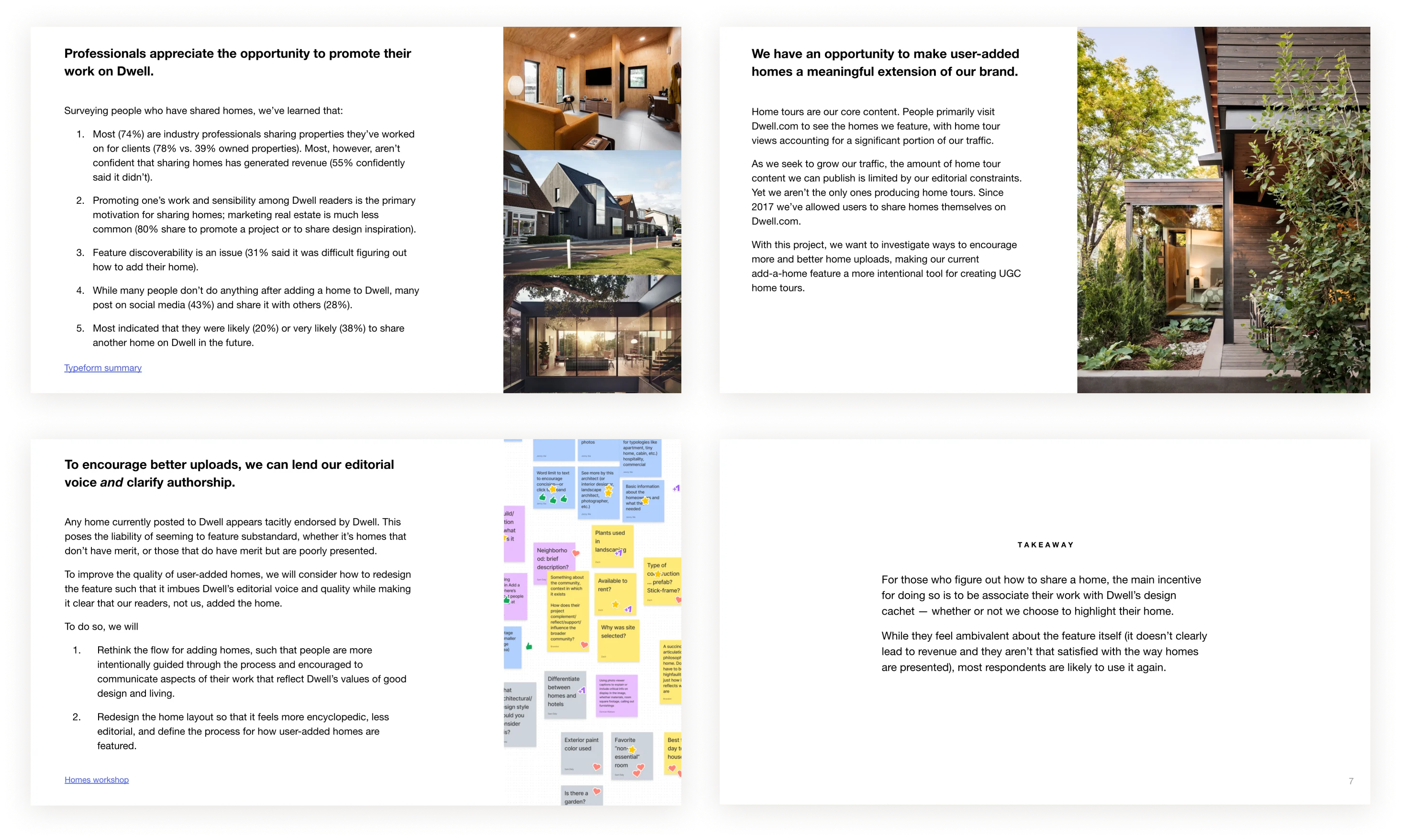
I began by interviewing users who had either uploaded content to Dwell.com in the past or were frequent visitors who might be interested in sharing their work. These sessions informed our priorities and early design ideas for the work. Workshops with stakeholders at Dwell further honed our hunches and clarified next steps.
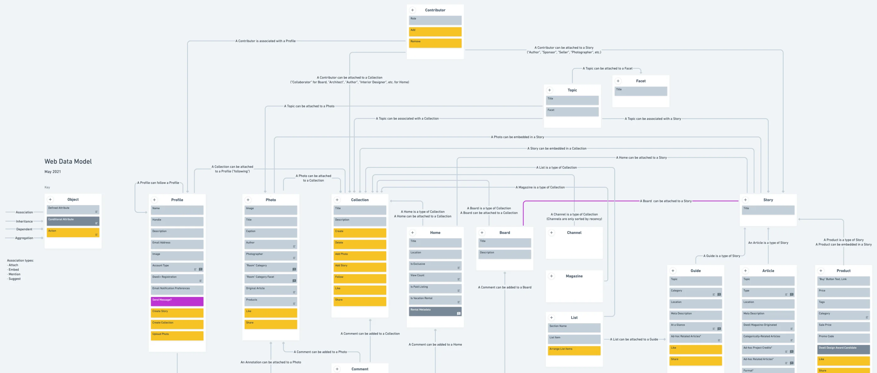
Once we had a solid enough strategic foundation to begin exploring design in more detail, I worked with our engineering lead to audit Dwell’s data model to get a sense for how projects could be implemented. We found that there was quite a bit of legacy code that could be dusted off and repurposed.
From there, we identified needs that weren’t supported by existing data attributes and read-write actions, and I started thinking through the project publication flow and views in low fidelity.

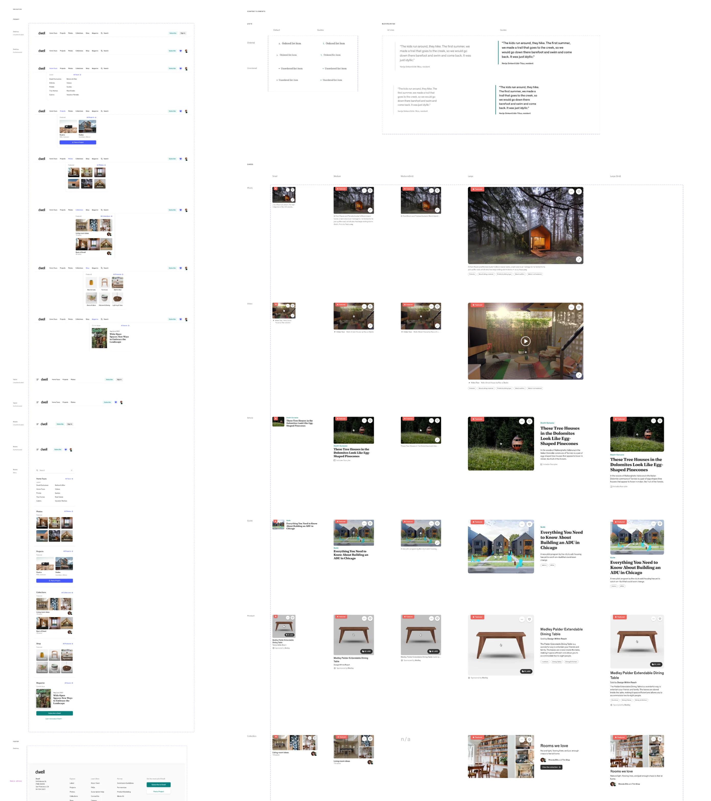
When making components for these layouts, I extended our web design system, which I originally based on our print editorial guidelines (though with a few digital twists).
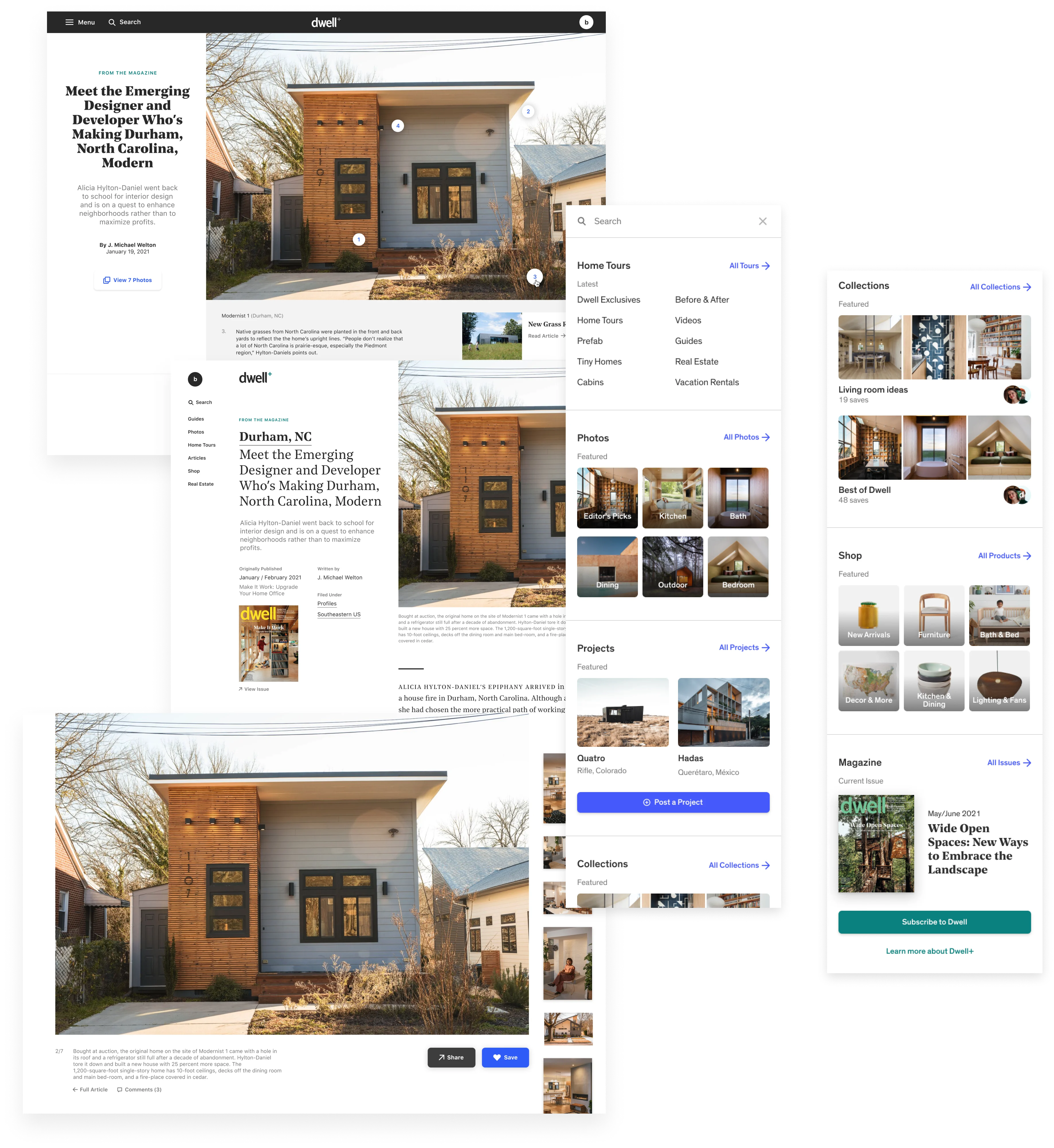
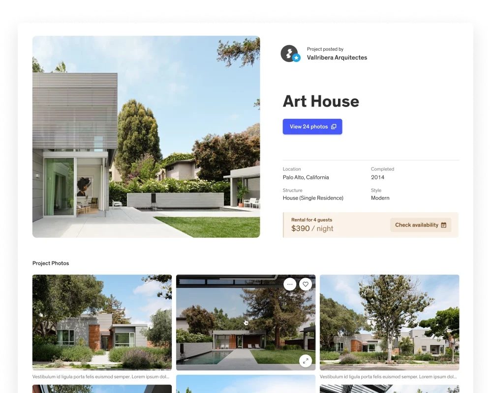
One of our priorities for the project detail page was to defer to imagery as much as possible, knowing that home photography is the most-viewed type of content on Dwell.com. The project header, containing a hero image and most common project information, sits above a tight grid of images and captions which, when clicked, bring a user into a full-screen gallery.
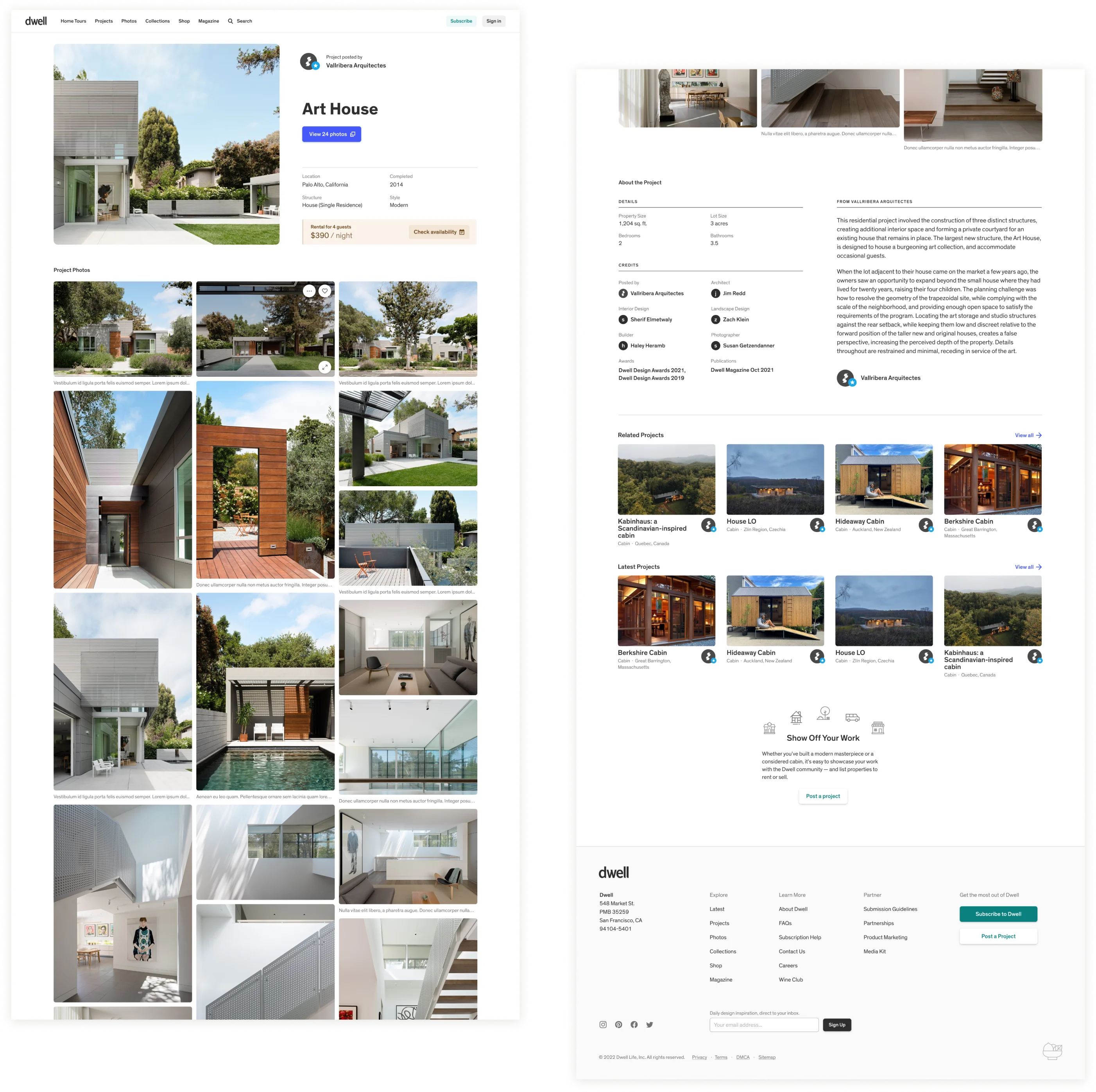
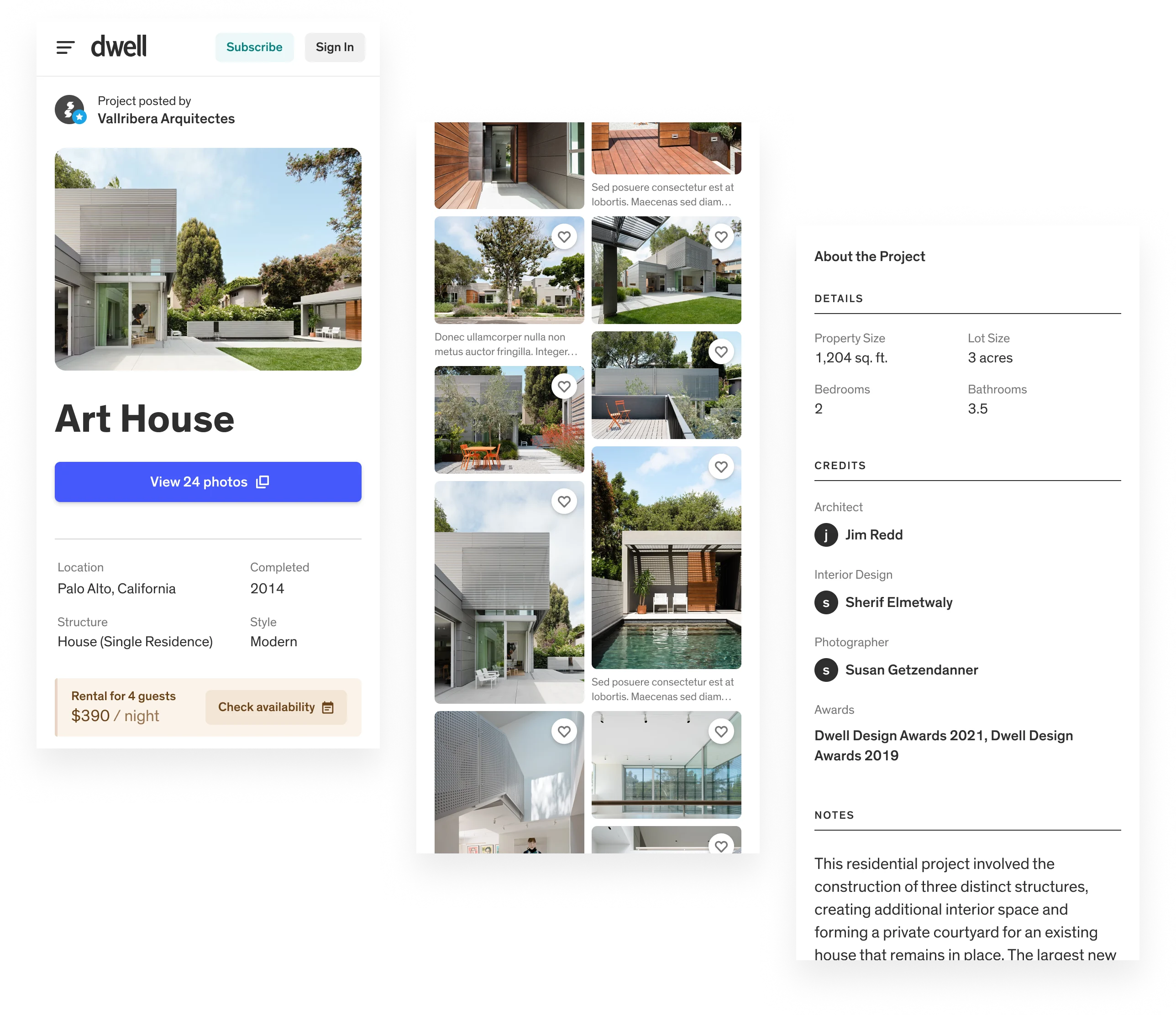
The majority of Dwell.com traffic comes from mobile devices, so we wanted it to feel like mobile apps users were familiar with, minus the UI cruft. To further promote readers’ work, we made a way for Dwell editors to feature projects, some of which have made it into the print magazine.
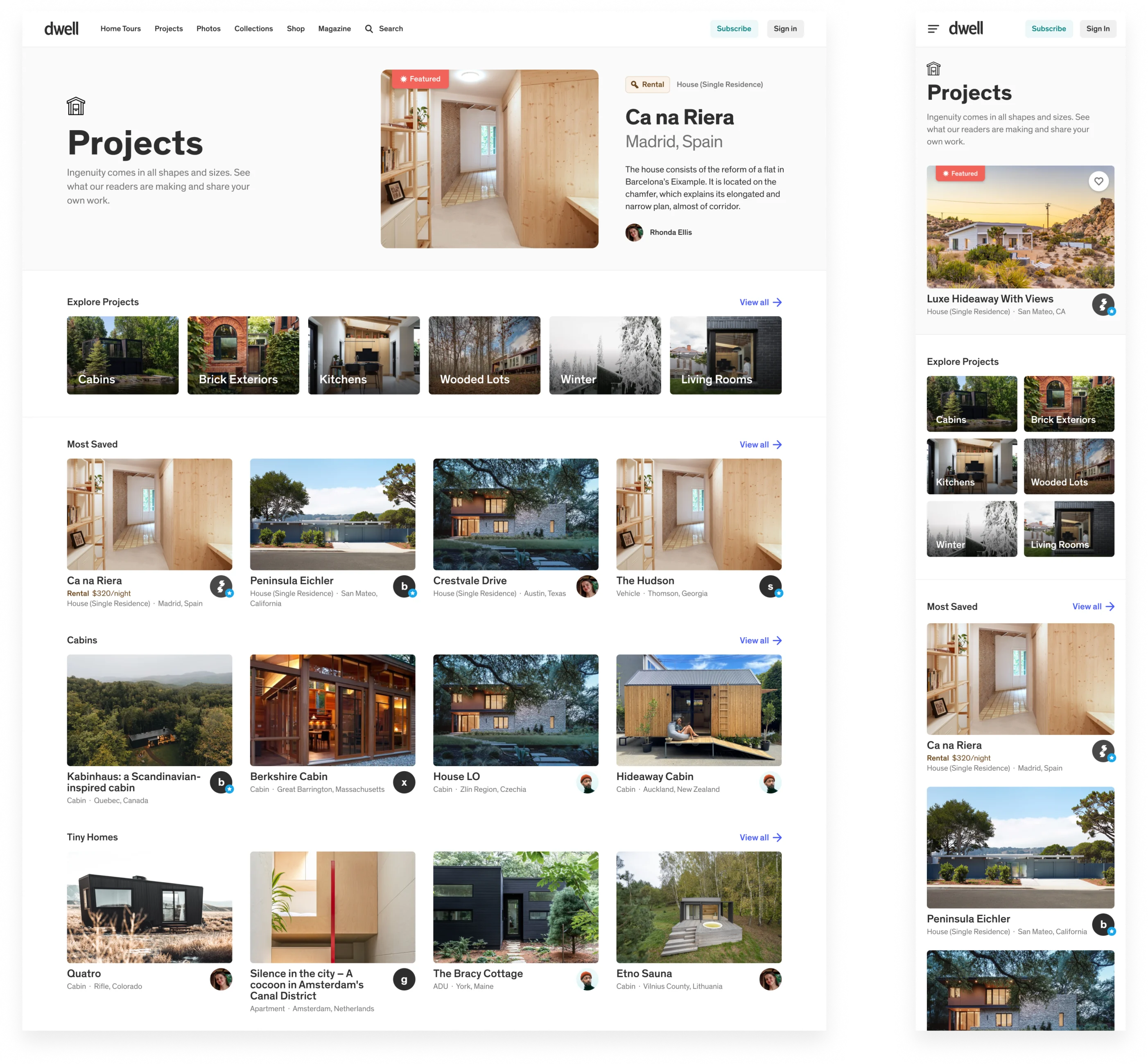
The quality of projects posted by early users of the feature was remarkable. By giving their work a place on Dwell’s editorial platform, we’ve seen homes, vans, cabins, houseboats, kitchens, renovations that show the diversity of design. Projects have become a key means of supporting Dwell’s mission of making modern design—a topic usually associated with pretension and prestige—accessible for everyday living.
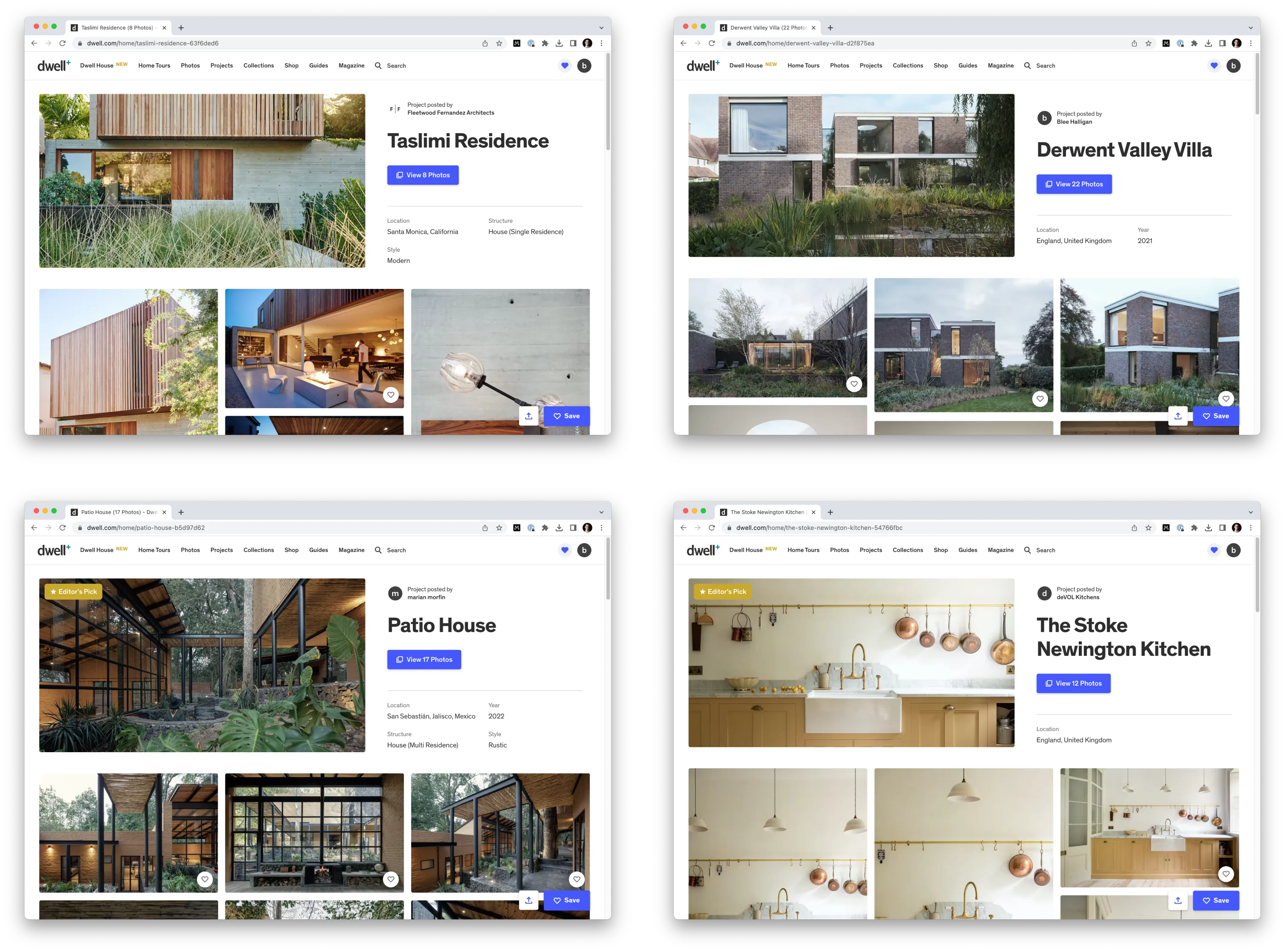
And projects have proven to be valuable to the company. Although overall Dwell.com traffic took a hit in 2022 (likely due a post-COVID turn away from interior design) project posts and visits increased. They not only bolstered overall web traffic, but proved to be a sustainable, growing content category in themselves, one that continues to flourish.
Follow desire paths. Rather than starting a new feature from scratch, build upon what's working—both with regard to how people are using the platform and what's already been built. Not only does this minimize risk (no one uploading projects, in this case), it provides a starting point for developing design solutions.
Invite customer co-creation. An editorial brand like Dwell lives or dies by the quality of its content. However, we found that many of our readers were already posting things that were at times indistinguishable from our own articles. Rather than shutting them out, we sought to more intentionally bring them in.
Use cues to guide content creation. It was important that readers feel confident about the quality of how their work is presented on Dwell.com. We took inspiration from Airbnb's approach to guiding users when adding listings to the platform, particularly how they thoughtfull break down each step and provide helpful guidance.
| Brandon Dorn | Product design, strategy, research |
| Zach Klein | CEO |
| Jim Redd | Engineering |