I designed a better way to interact with templates in Whimsical, helping people get more out of the app for their unique needs
Role
Product design lead
Responsibilities
Product strategy, prototyping, design system, user research
Whimsical began in 2017 as a tool for making flowcharts yet has evolved into a multi-use platform that helps teams shape product ideas. However, as we built additional features to support this shaping work—things like wireframes, docs, and task-specific features like sequence diagrams—we realized that our customers’ use of the app wasn’t following our evolving feature set. We were designing Whimsical to be used (and using it ourselves) in a much fuller way than our customers were.
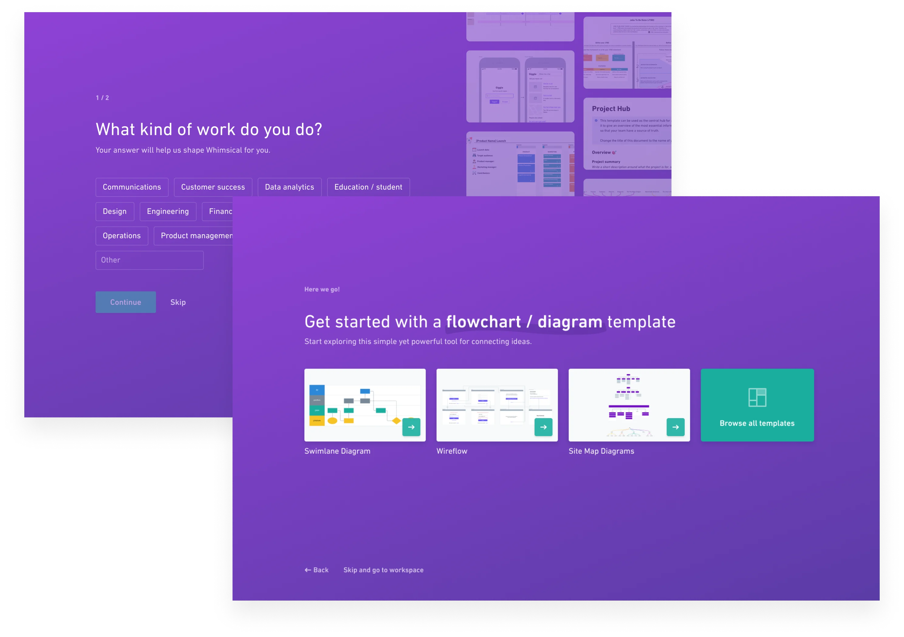
Templates emerged as a key means for showing people—especially new signups—how Whimsical can be used and how to get the most out of the app. While we had a passable feature at the time, it went unnoticed and unused by the majority of our users. So we set out to improve the the discoverability of our template library while also improving its overall quality. Our hope was to introduce people to new ways of working in Whimsical that went beyond the creation of one-off, intermittent flowcharts.
I partnered with an engineer to shape requirements, iterate a prototype, establish editorial guidelines, and create a better browsing experience inside the app and on Whimsical.com.
The Project
Our overall hypothesis for this work was that Whimsical users would use more of the app’s feature set, and do so regularly, if they were shown relevant templates in key contexts of the app.
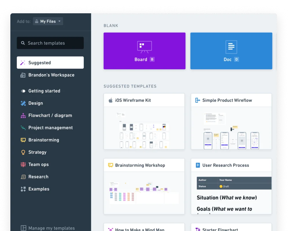
We settled on two general strategies for accomplishing this: increase template discoverability and improve the quality of our templates. We knew from our customer success team that people who found templates in Whimsical often found them useful, yet these discoveries were rare. And since the preexisting template library was more or less a generic view of Whimsical files, users had no way of browsing or previewing templates before selecting one. Not only was it prohibitively difficult to find templates at all, people couldn’t find the right one for their task.
Yet better access to templates wouldn’t matter without a curated, well-crafted library of them. So in addition to designing in-app and public template browsers, I led the creation of layout and editorial guidelines for others to follow as we expanded our Whimsical-created templates.
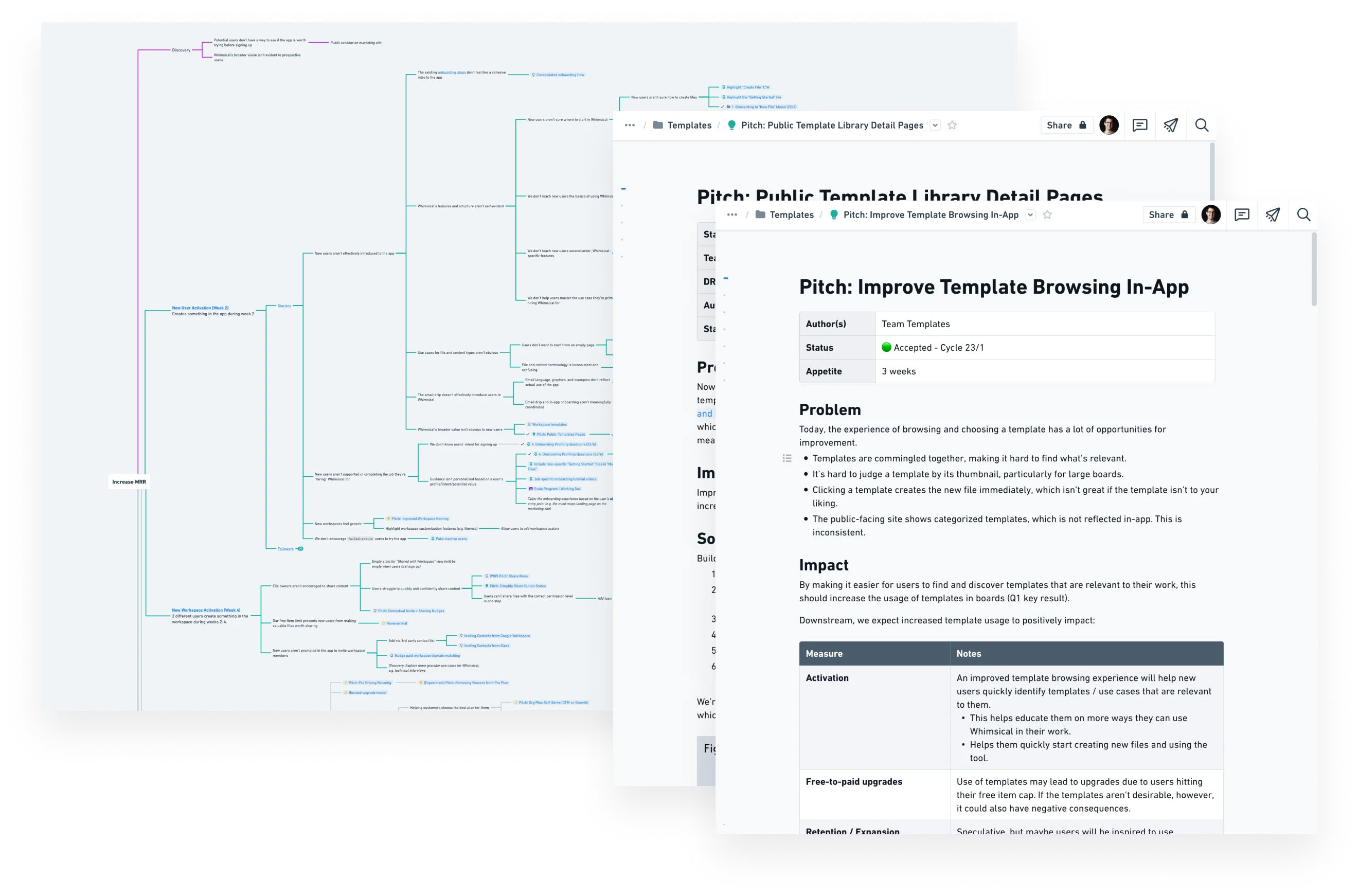
As I shaped the pitch, I drew ideas for the work from our product solution tree, where I and others collected kept draft pitches and miscellaneous ideas that came to us over the course of other projects (more on that here.) From there, I worked through a few rounds of wireframes to explore ideas for the layout of the app before designing at high fidelity.
Designing Whimsical...in Whimsical.
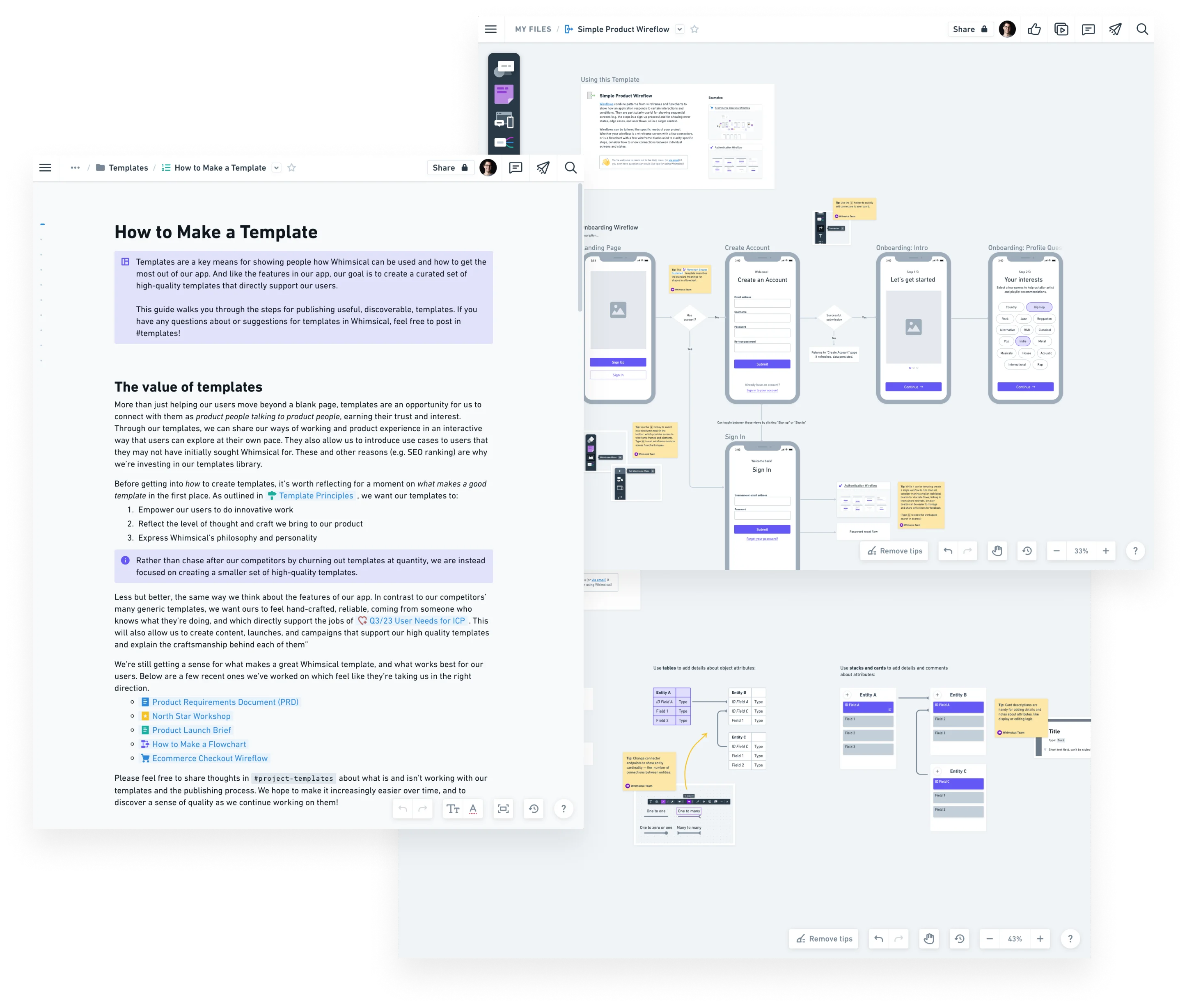
We landed on a layout for the template browser that felt at home within the Whimsical UI, extending the design of our file cards to allow users to preview files when clicking them. I worked with the engineer to define the data model and related search and ordering logic for the templates. To make the template browser feel consistent with file browsing elsewhere in Whimsical, it builds upon core elements of the design system, extending it in a few targeted ways.
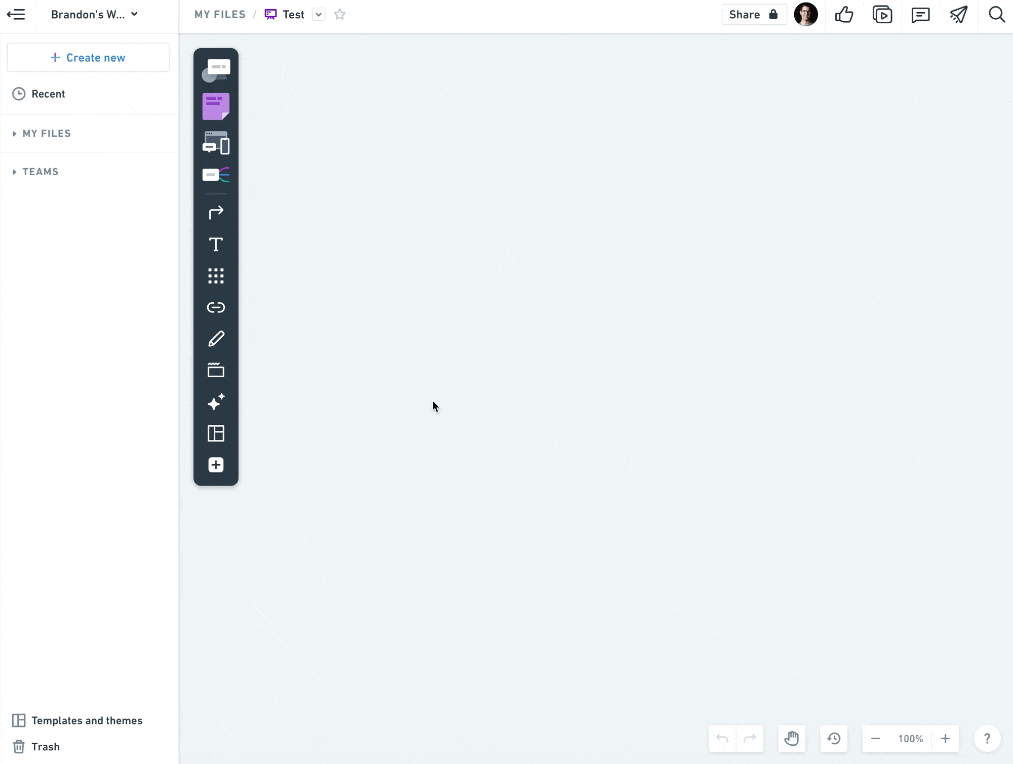
We made the template browser accessible through the board toolbar, knowing that this was the primary means by which people create content in boards. And while this bore out in practice (a majority of templates were created through this avenue), we wanted to encourage people to use it not only to augment existing files but use it to create new files. So we introduced a sidebar with suggested templates that displays when users create an empty file, and experimented with ways of introducing templates in the new user onboarding flow.
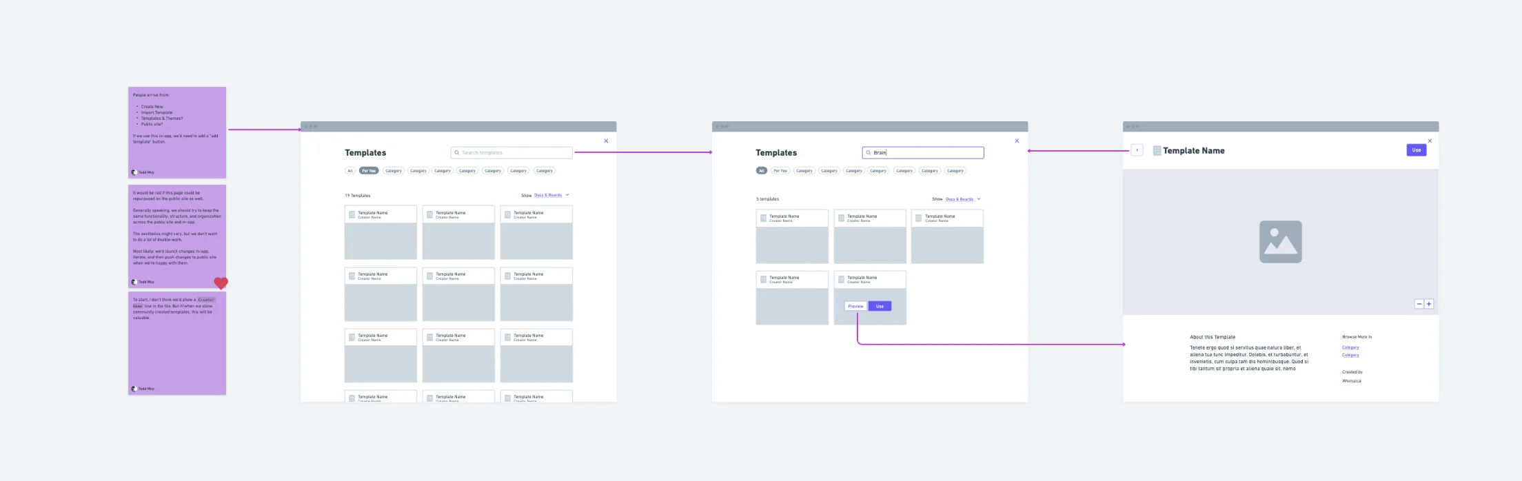
I also redesigned the “Create new file” modal to feature suggested templates more prominently. When working on this, we ran into an interesting problem trying to figure out the transition from the “Create new” modal to the full template browser. Rather than just swapping modals, I tweaked the layouts of each and designed an animation showing how the modal could expand into the browser when “Browse all” is clicked. More than just a nice easter egg, the transition shows users that the template library is an ideal place from which to start a new file.
As we began planning the expansion of our template library I wrote a guide that showed how to create and publish templates, setting a standard for new and revised templates. My goal was for us to not only to create templates that felt consistent, but ones that meaningfully guided product teams through specific tasks, whether running workshops, creating roadmaps, or designing wireflows. And, naturally, I made a template for others to use when creating templates.
The engineer and I also designed and built a way to add “tips” to templates: objects that guide users within the context of the template itself, which can be easily deleted at one go. This feature came from input from users and our own experience of having to repeatedly delete placeholder objects from templates.
Wrapping Up
Templates are a kind of meta-feature in the way that they can change how people use and perceive a product, revealing valuable features and jump-starting projects. As such, they’ve become a key means for introducing new features (like sequence diagrams), reintroducing older ones (like mind maps), and perhaps more importantly, demonstrating how multiple features work together. The wireflow template is a good example of this, showing how wireframes and flowchart elements become even more expressive when used in tandem.
Brandon's work is consistently high quality – he has particular attention to detail in pitches, UX and visual design work and it show that he strives to create aesthetically pleasing and highly usable designs.
Principal designer, Whimsical
Takeaways
Use the app to teach the app. The best, most durable kind of learning comes from in-context, direct manipulation of the material itself. Whether or not people use templates to create their final files, we found that users valued seeing how we use Whimsical for certain use cases.
First impressions of features matter. Where and how we introduced templates affected how likely people were to continue using templates—and Whimsical. We sought to introduce templates when in contexts and moments where they would be most meaningful.
Systems set standards. By designing a mini design system for templates themselves, we were able to create a replicable, predictable way for creating and interacting with templates.