I redesigned the Clearinghouse's verification platform, reworking a convoluted request flow to make it easier for employers to perform background validations
Role
Product design lead
Responsibilities
Interaction design, information design, product strategy, usability testing, design system development
The National Student Clearinghouse maintains the graduation data for all high schools, colleges, and credentialing organizations in the United States. It's how Spotify knows if you're actually a student or still mooching off your university email address. But more importantly, employers across the country use it to verify job applicants' education background. So it's also how you can be sure that your doctor actually got that MD and did their residency.
We worked with the Clearinghouse to redesign the interface used by people in HR to perform these validations. It hadn't been touched for nearly ten years, and needed to evolve to support new Clearinghouse initiatives. In addition to refresh their design language, I helped them rethink the structure of the verification process to clarify and expedite the process for employers. Rounds of moderated research revealed key improvements that will have a ripple effect across the hundreds of thousands of verifications performed every year.
The Project
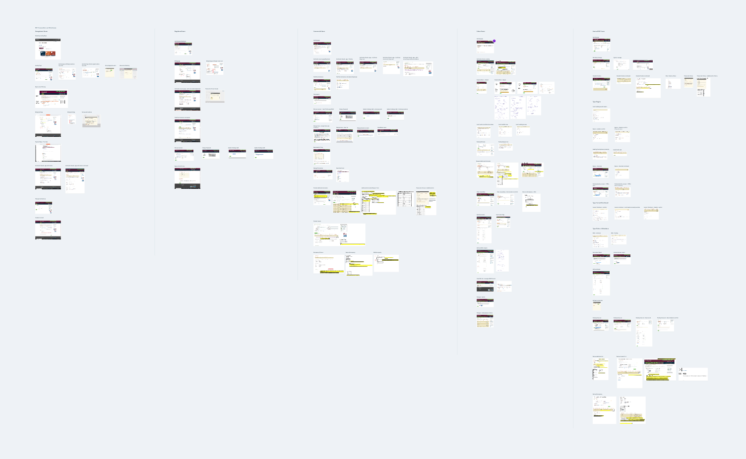
Part of the discovery phase of the project involved auditing the existing verification web app. I assembled a Whimsical board that included annotations of screens and states, which served as a helpful reference over the course of the project.
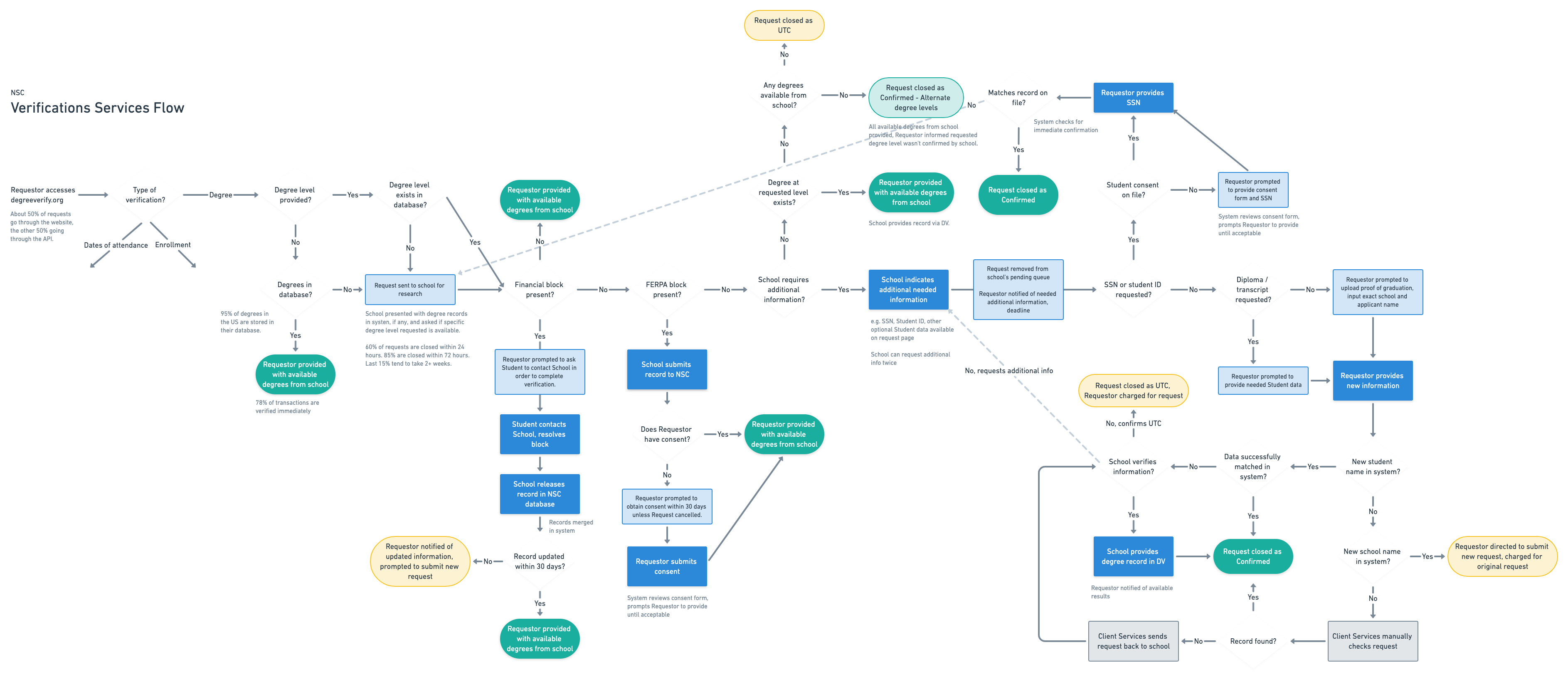
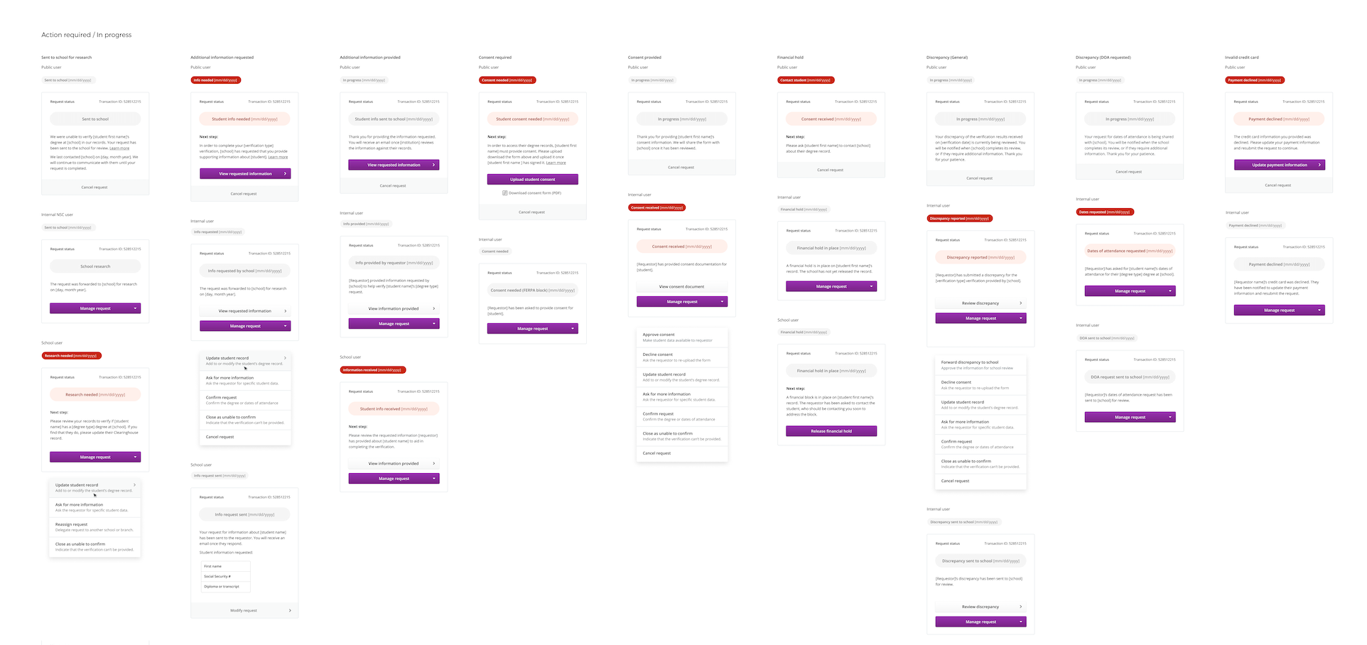
I then worked with the team to diagram the flow of information through the current system. Variability across different types of verifications and users made parts of the flow unavoidably complex. However, we began to identify ways that this complexity could be better handled through interface improvements.
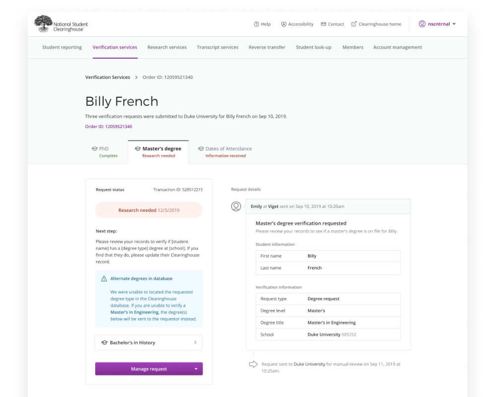
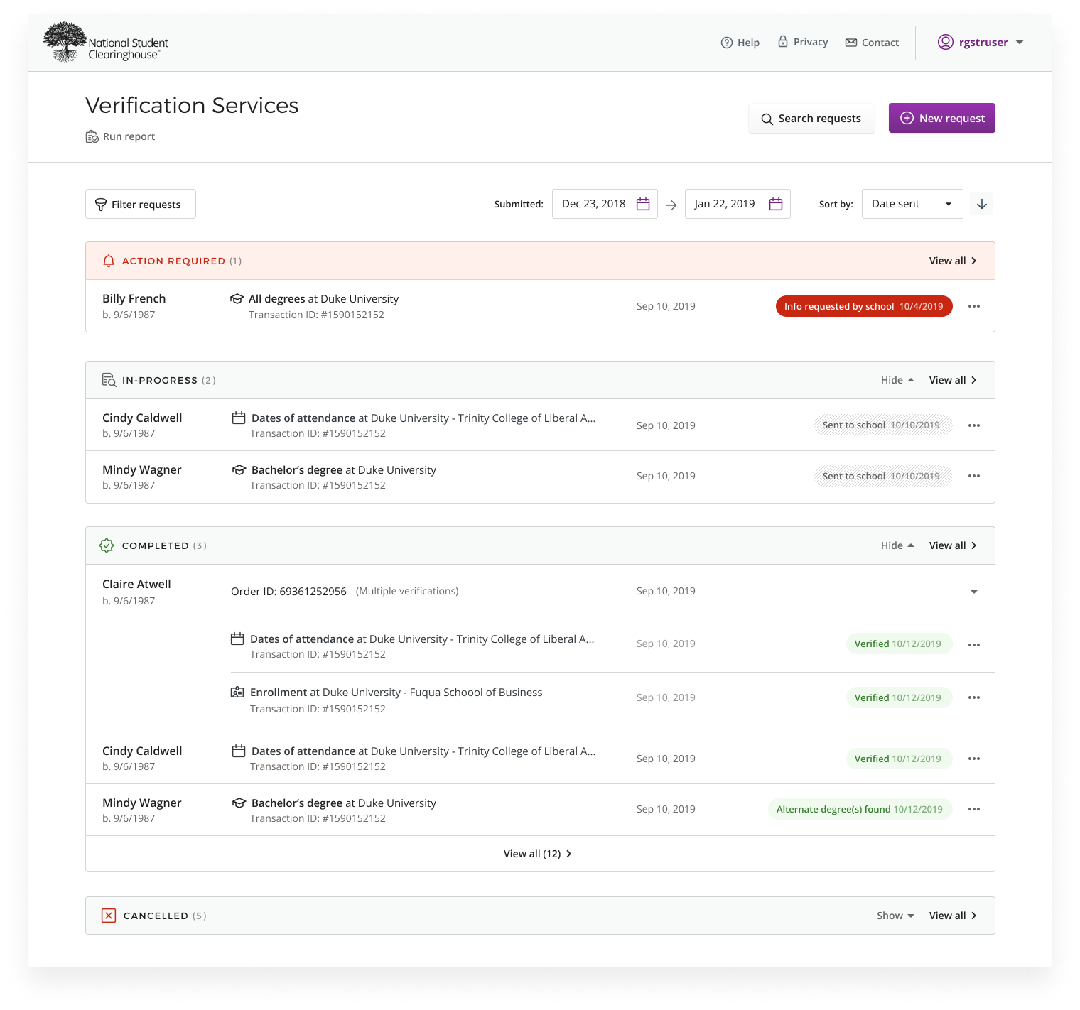
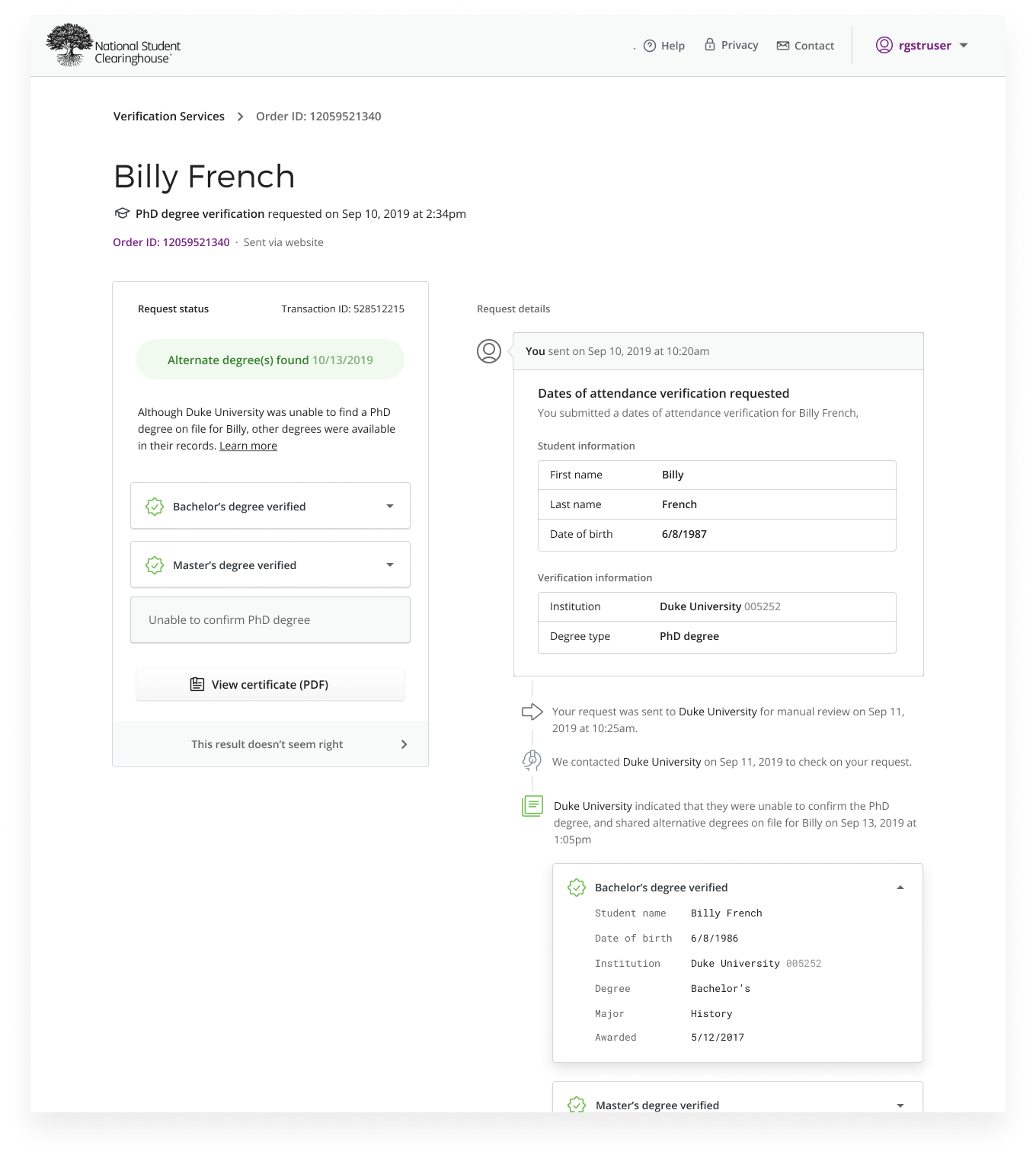
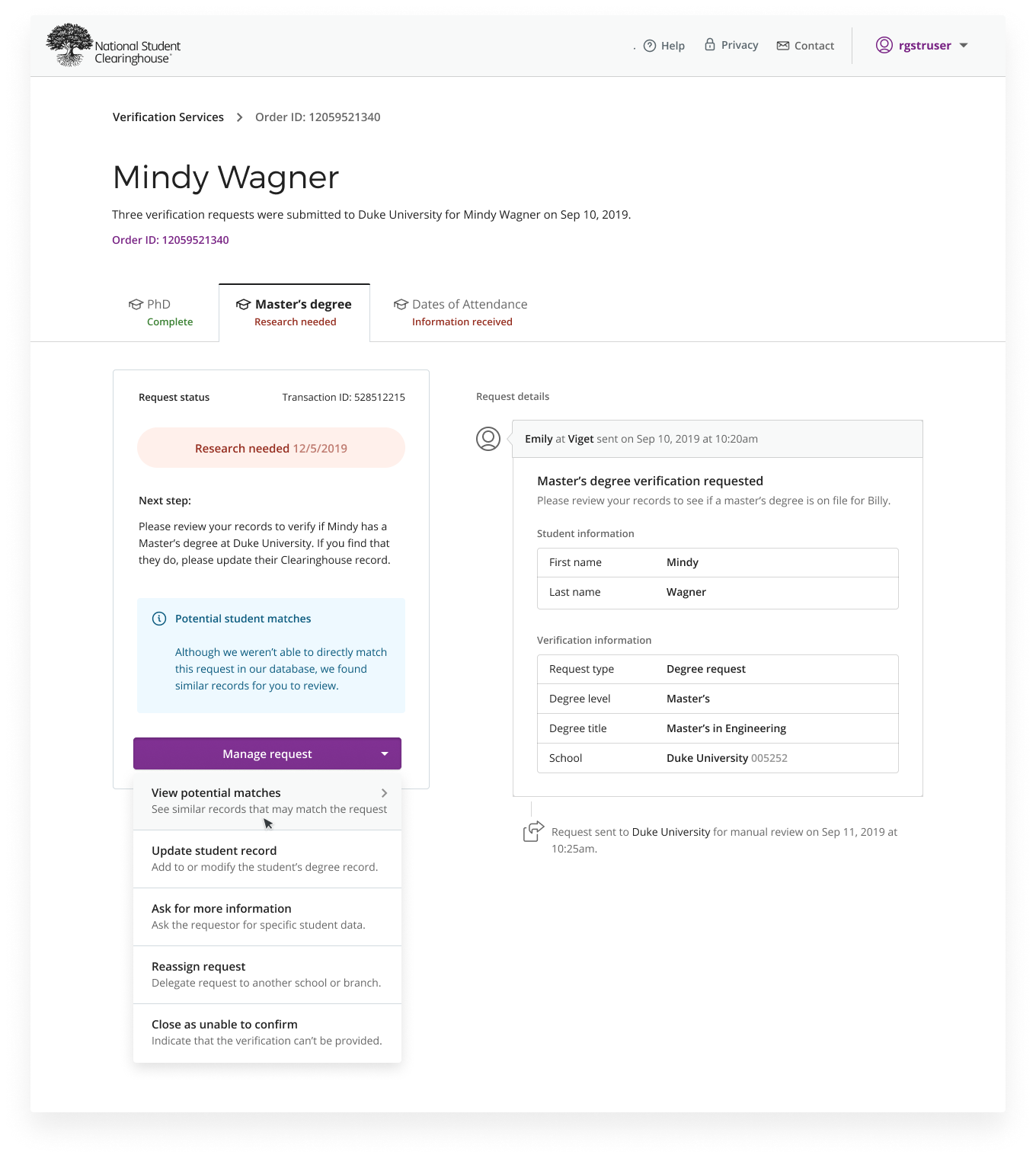
One goal of the redesign was to clarify the status of verification requests for people who use the application intermittently. These infrequent users found themselves having to re-learn the existing interface each time they used it, so I sought to introduce design patterns that clearly display key information while avoiding visual busyness and heavy-handedness.
Whereas the previous overview pages were short on information and long on explanatory copy, I designed patterns for the verification timelines that are quickly scannable and give immediate guidance. Since guidance shown to users in the timeline varies according to their account, verification type, and other factors, I documented permutations of the verification statuses for the Clearinghouse development team. Usability tests helped us hone the language across variations of these pages.
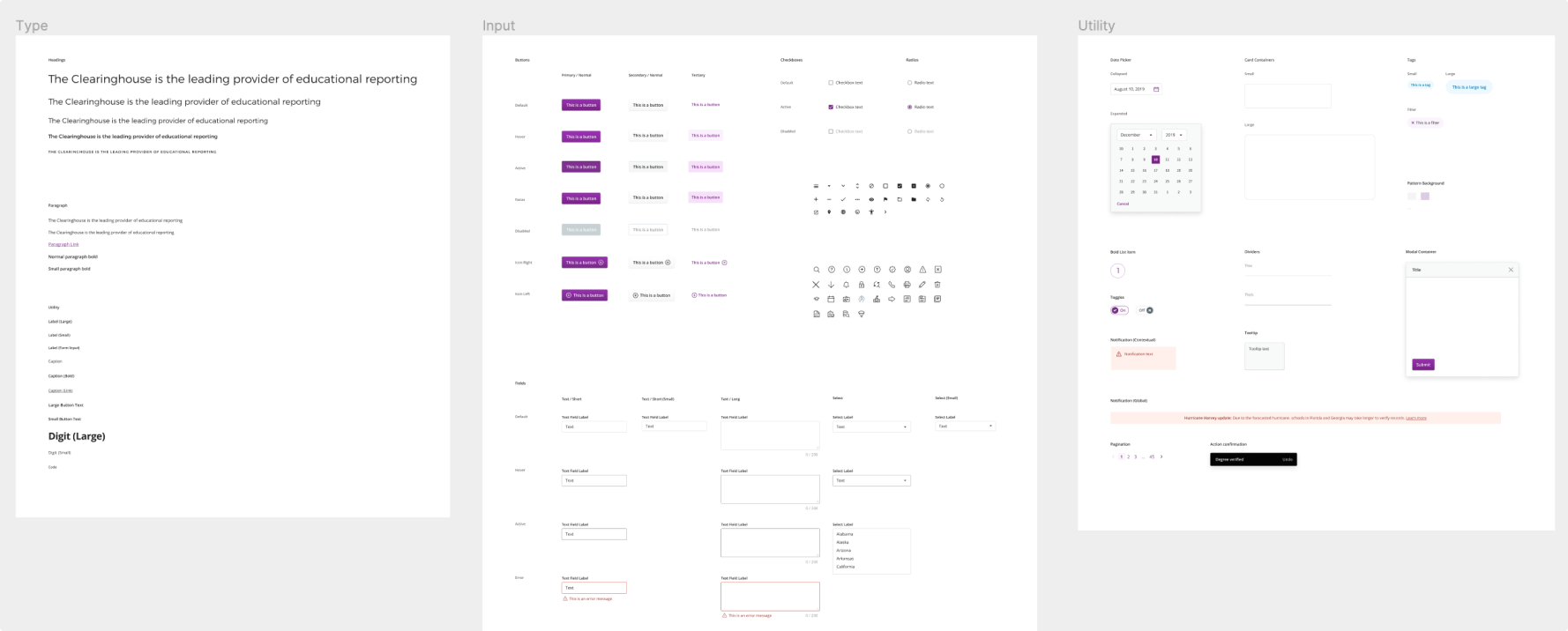
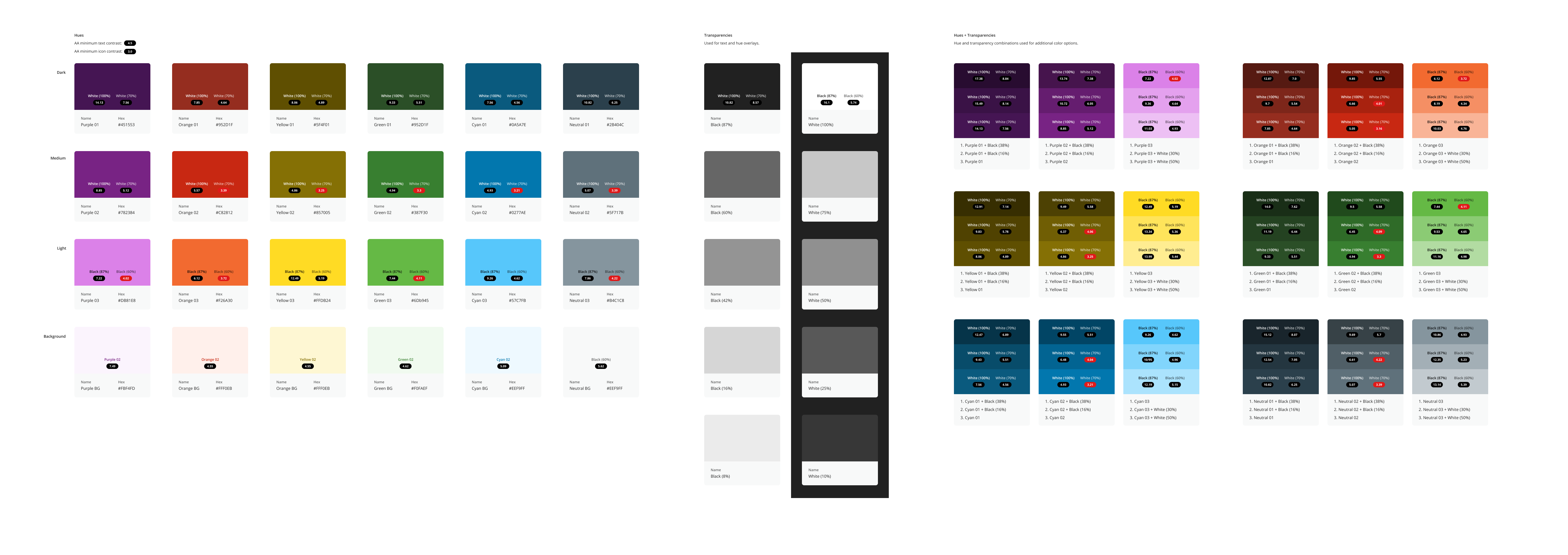
In addition to documenting design patterns based on the Clearinghouse's rebranding work, I defined a fuller color palette for them to use across their interfaces. The system shows which text and background combinations pass accessibility standards, and the intent for certain colors in the UI.
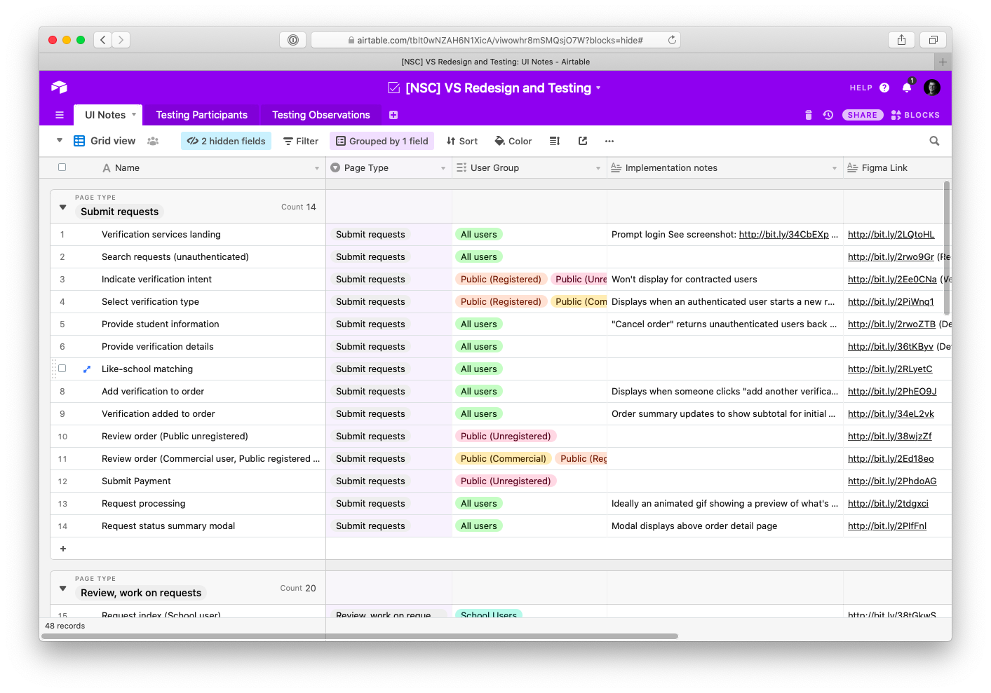
Since the Clearinghouse development team wasn't directly involved in the research and design of the new interface, I consolidated implementation notes before handing off designs, addressing questions and ambiguities that arose in reviews with developers. Instead of annotating files directly, I find it more helpful to consolidate notes about logic, states, and other considerations in Airtable and link to Figma files.
Wrapping Up
By improving access to this data, the administrative burden was lessened for both employers and the Clearinghouse: employers are able to come to conclusions about applicants more quickly and confidently, and the Clearinghouse fields fewer support calls.
I hadn't heard of the Clearinghouse before this project. Yet over the course of our work together I learned the importance and scale of the information they provide access to; it's what ensures the integrity of our country's workforce. Some of my most memorable projects involve helping behind-the-scenes organizations like these improve their utilities in ways unseen by a majority of the public. And there's so much of this work to be done.
With every single flow, when we explained it to Brandon, he created something so beautiful and simple. It was amazing to watch. And, even better, if we ever requested changes or reflected concern about how something might be confusing to a customer, Brandon took our feedback with such a positive attitude and would design something that perfectly met what we were looking for.
Key Clearinghouse stakeholder
Takeaways
Invite subject matter experts into the design process. The Clearinghouse team was familiar with the complexities of the application and the improvements they were after. Close collaboration with them helped me avoid pitfalls they encountered when working through the problems previously.
Work broadly to 75%, then refine. Instead of laboring over small sections of the design to perfection, establish an overall structure and bring core features to moderate-high fidelity before taking a final pass. Edge cases and unforeseen complexities reveal themselves as you work across the whole terrain of the app, allowing time to prioritize refinements before launch.
Go onsite. Multi-day onsite visits with the client team gave us focused time to work through thorny interactions together on a whiteboard. While remote work is becoming increasingly the norm, in-person sessions like these led to ideas that we may not have come across otherwise.