I helped Rotary International understand how its members use (and don't use) an aging member portal, providing a roadmap for a strategic overhaul
Role
User researcher
Responsibilities
Usability testing, moderated user research, analysis, workshop facilitation
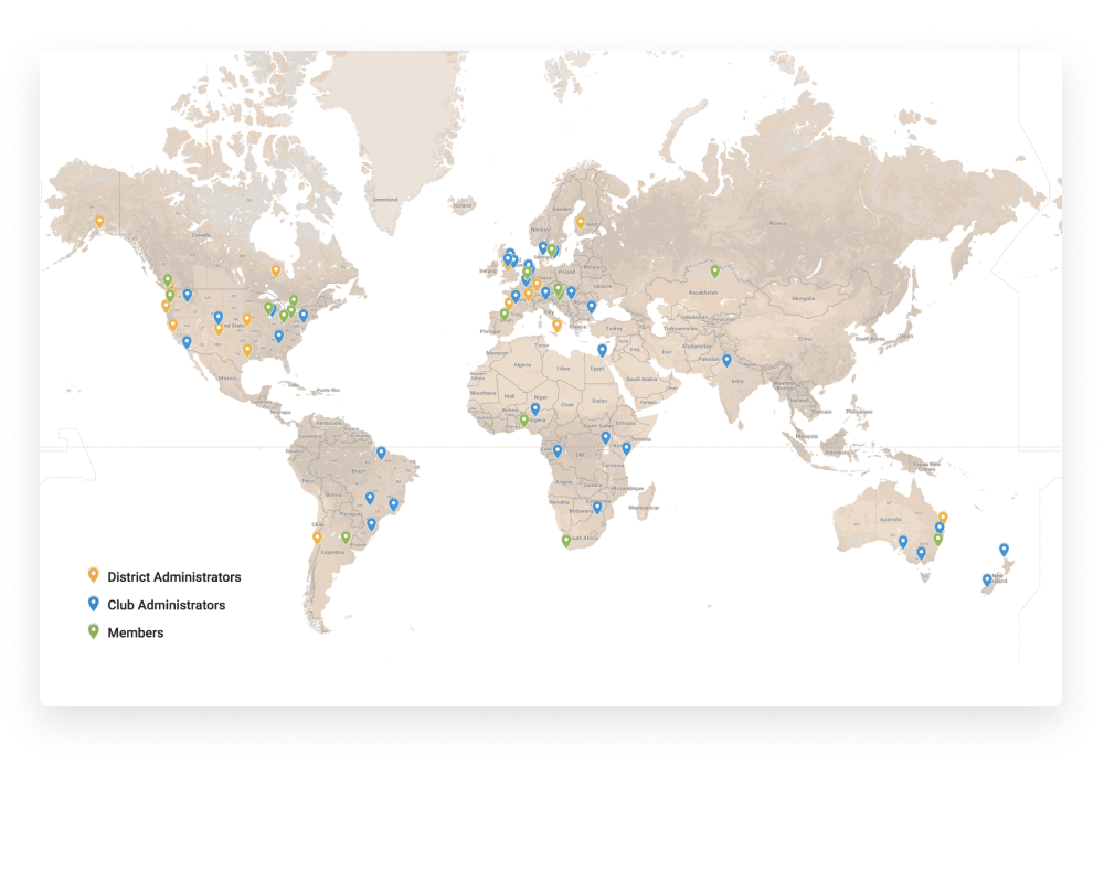
One of the world's longstanding service organizations, Rotary International's network is made up of 1.2 million members and 35,000 clubs around the world, each given autonomy in how they serve their communities. To aid members in their efforts, Rotary International created MyRotary, a website that provides guidance, news, administrative support, and ways for members to connect with one another. Yet years after launch, user behavior had changed and the website wasn't meeting members' needs.
Before embarking on a design and development overahul, Rotary International wanted to better understand how MyRotary needed to evolve. And in true Rotary fashion, they wanted to act with input from the community they were serving — in this case their own international member base.
Working with a small team of researchers, I helped develop a research plan that involved remote moderated usability tests, an international survey, and a set of unmoderated navigation tests to guide the redesign of the member portal. Responses from and conversations with over 3,300 Rotarians showed us how to make MyRotary an essential aid to their work.
The Project
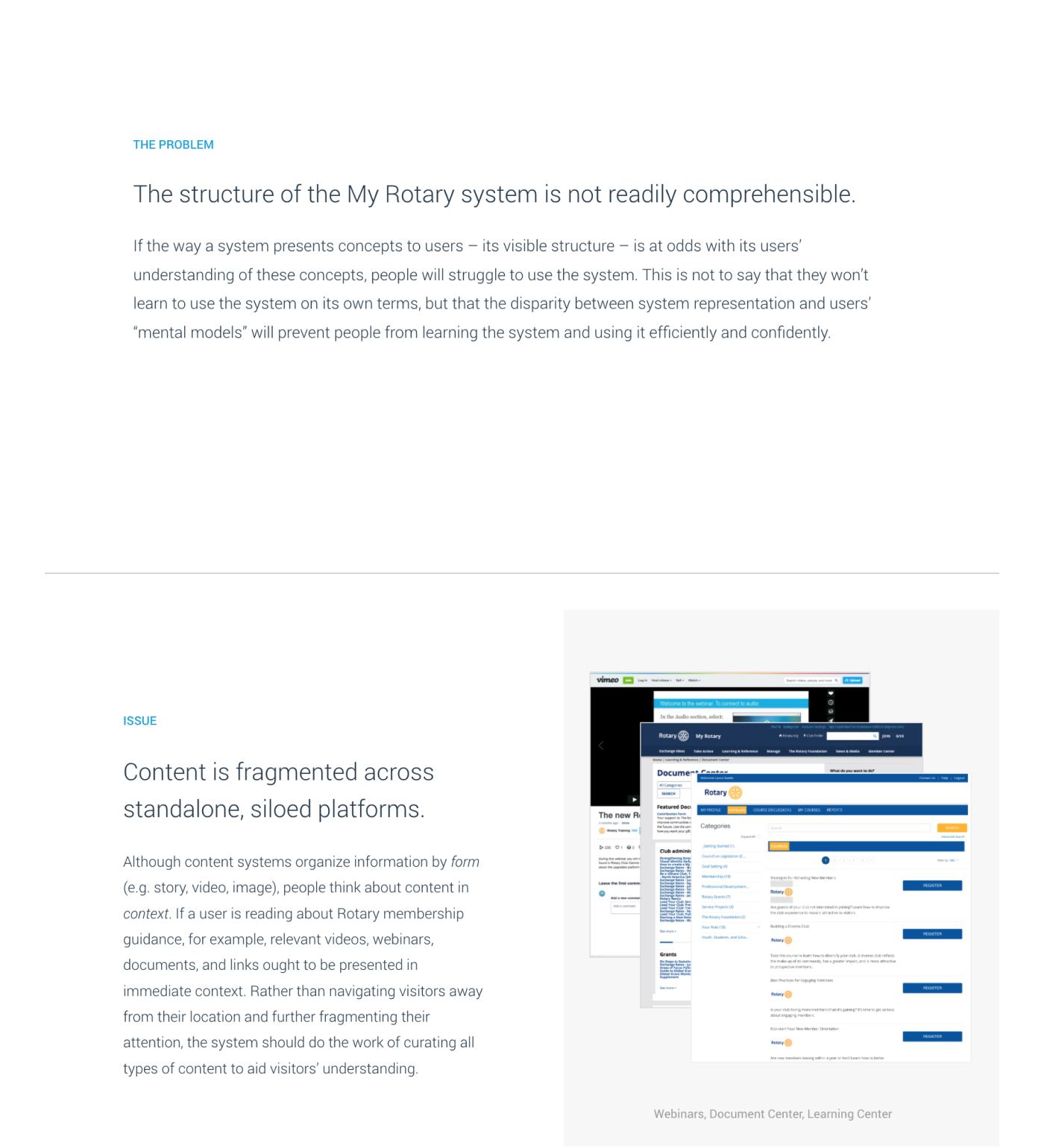
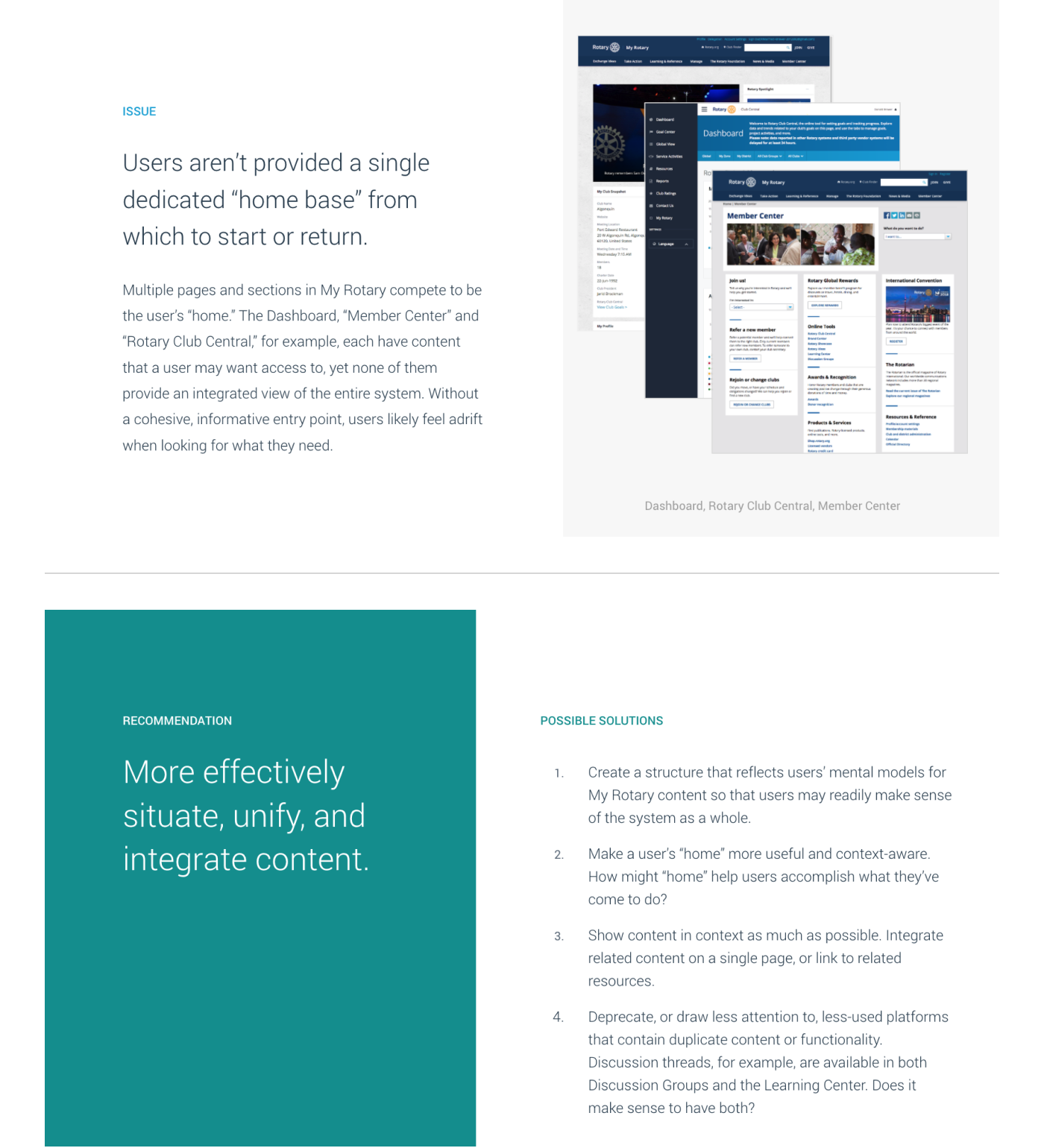
We began with an in-depth audit of the MyRotary platform, identifying issues ranging from usability to content discepancies to convoluted navigation systems. The Rotary International team was able to begin working on many of these while we began the research process in full.
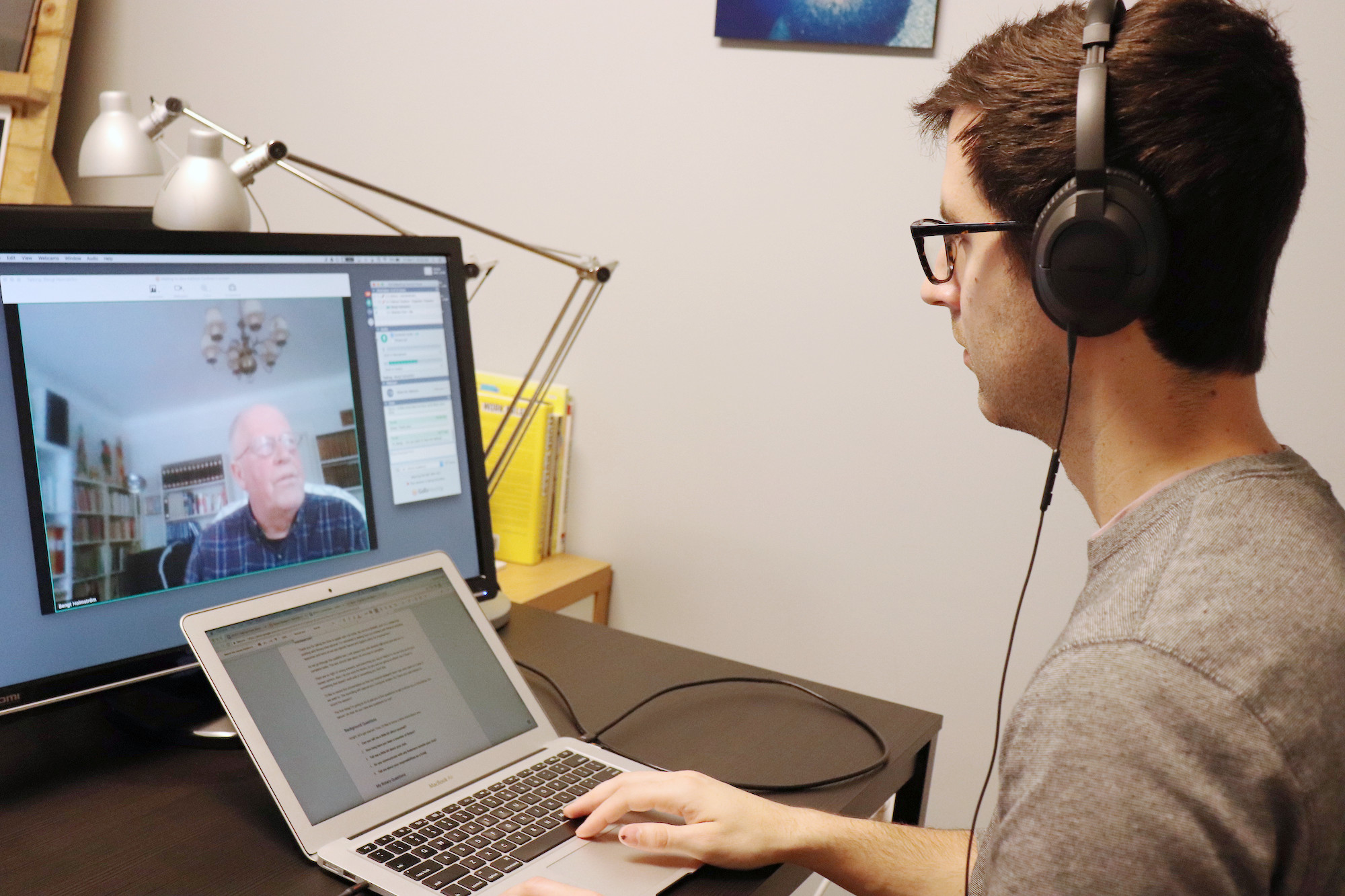
We then conducted over 40 moderated usability sessions with members from five continents. While this made for early days and light nights, first-hand observation of people using the platform and conversations about the nuances of their club's processes helped us understand how the platform was falling short and what content and features would be useful to them.
Many of our conversations focused on the challenges of learning the ropes as a new Rotarian or recently-appointed club leader. We paid particular attention to the variety of onboarding processes and the tools people were using outside of MyRotary. People shared about ways to relieve the burden of administrative tasks so that they could focus on the real work of serving others.
Rotarians are a perennially cheery, dedicated bunch, willing to share about the meaning of the organization in their lives. One member even sang to us!
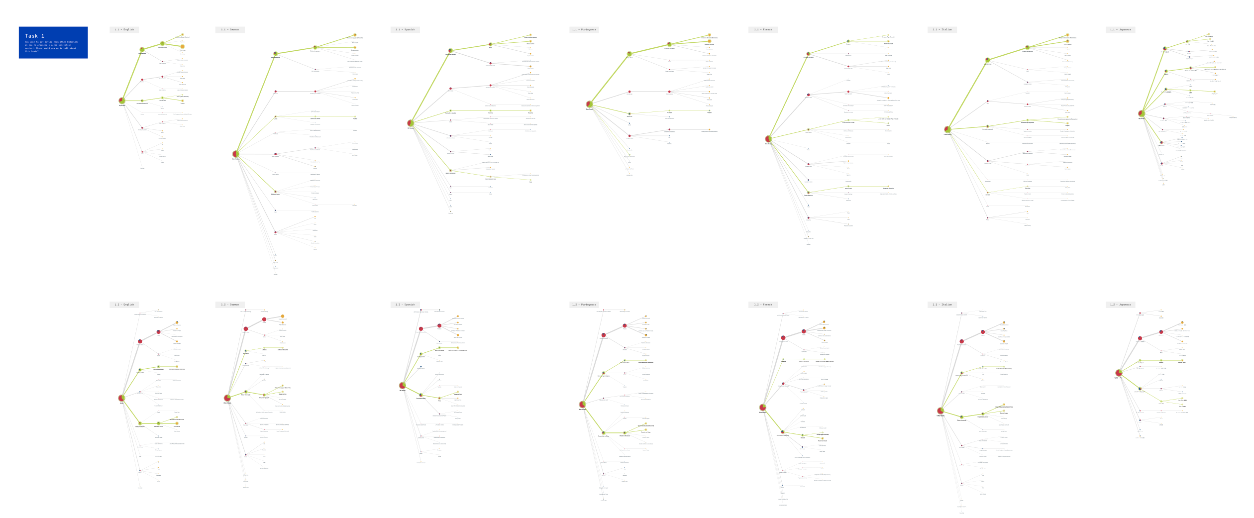
To complement the moderated usability tests, we conducted two navigation tests using Treejack: one to establish a baseline, and another to test a revised information architecture. Because MyRotary is provided in seven different languages, we created seven different tests and compared the results for each task. This allowed us to test an internationalized navigation system that was globally consistent while accounting for language-specific nuances. Below is an example of one of our task anaylsis, in which we compared navigation paths for users in each language. I wrote a blog post about our approach to learning from these tests.
Our final analysis included a revised vision statement for the platform based on themes identified across each research methodology. Based on that statement, we provided a series of macro strategic recommendations for evolving the platform as well as specific design considerations for adapting it to real-life member usage.
Wrapping Up
Many of the improvements that needed to be made to the platform were clear from the start: improving performance, shoring up accessibility, bringing the interface in line with Rotary's updated brand standards. Yet our research gave direction to deeper, more ambiguous questions about information architecture and internationalization that enabled us to give substantive recommendations. With these, the Rotary International team was able to put together a roadmap for evolving the platform for the next generation of Rotarians, ensuring that the platform serves them, not the other way around.
Takeaways
Think analog first, then digital. Our usability tests revealed that the most helpful resources provided to new Rotarians were often physical printouts given to them by other members. We began to document instances where physical materials took precedence over digital ones, which informed content strategy for MyRotary
Watch for workarounds. People are naturally resourceful, often finding ways to solve problems despite the tools we build for them. Unintended uses of the platform and instances of people turning to other tools revealed important insights for how to change it.
Treat vision statements as hypotheses. Lofty and vague, vision statements for what a product should be often don't match what users need it to be. We broke down Rotary's initial vision statement for MyRotary into a set of testable hypotheses that informed the structure of our research plan, and showed in our final analysis how to modify it to match members' needs.